



The Product Related widget from Wow Elements Pro is designed to dynamically display related WooCommerce products within your website layouts. It is primarily used in the Theme Builder to create custom Single Product templates, allowing related products to be automatically pulled and displayed based on the current product. With flexible layout, query, and styling controls, you can easily customize the related products section to match your store’s branding, encourage product discovery, and increase cross-selling opportunities. In this documentation, we will guide you through how to use and customize the Product Related widget in Wow Elements Pro.
Enable the Product Related Widget #
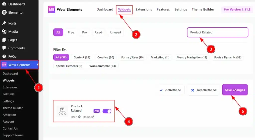
To use the Product Related by Wow Elements Pro, first, you have to enable the widget.
- Go to WordPress Dashboard → Wow Elements Pro Plugin dashboard.
- Then Click the Widgets Tab.
- Search the Product Related Widget Name.
- Enable the Product Related Widget.
- Hit the Save Settings Button.
Note: You must need to download the WooCommerce plugin first and activate the plugin to get the option to enable the widget.
Things That Must Need To Do Before Using The Widget #
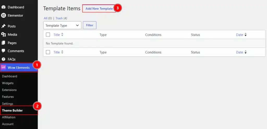
1. Go to WP Dashboard → Wow Elements.
2. Click on the Theme Builder Tab.
3. Now, click on the Add New Template to create new template.
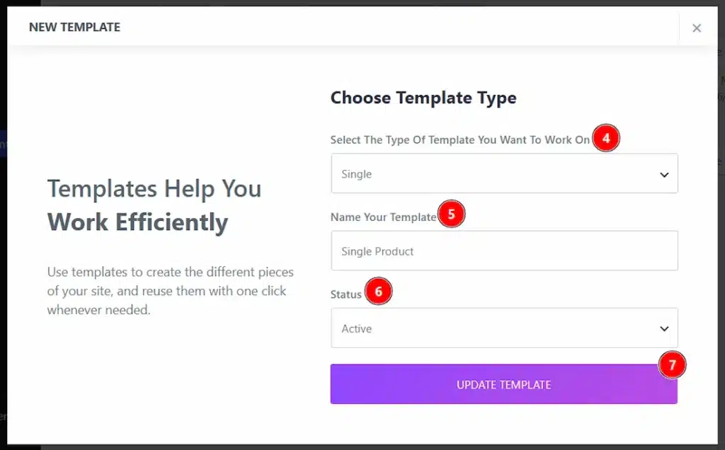
4. Here, in this field you have to select the type of template where you want to work. We have selected the Product Type Single category template.
5. You can set a name for your template in this field.
6. You can set the status of the template to active or inactive with this option.
7. You can click on the create template button to complete the creation and once it created it will automatically redirect your to the elementor editor to create your design.
Note: You must have to activate the WooCommerce plugin and also you must have some active products.
Inserting the Product Related widget #
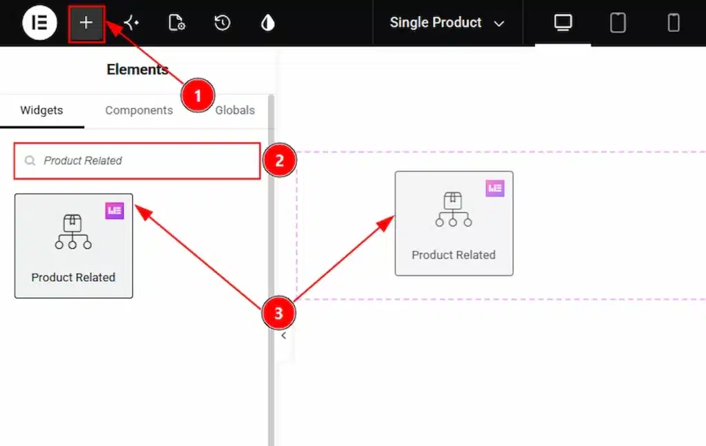
After the editor open within the theme builder, please do the followings to use the Product Related widget –
1. Hit the “+” icon Button.
2. Search the Product Related widget.
3. Drag the widget and drop it on the editor page
Content Tab Overview #
Related Products Section #
Go to Content → Related Products
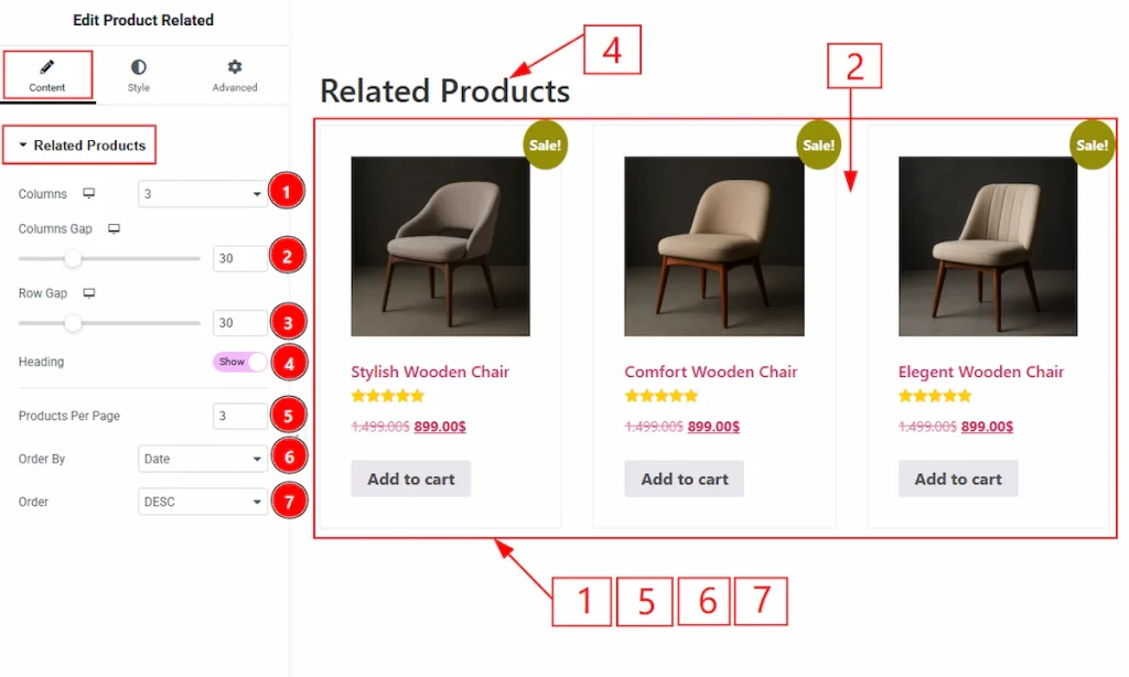
1. Columns: You can adjust the limit of the columns that you want to show to your audience with this option.
2. Columns Gap: You can adjust the space between the columns with this option.
3. Row Gap: You can adjust the space between the rows with this option.
4. Heading: Enable the switcher to show the heading to your audience with this option.
5. Products Per Page: You can set the limit of the products that will appear per page with this option.
6. Order By: You can set the products appearance as per the title, date, price, popularity, rating, random and menu order.
7. Order: You can arrange the product as per ascending or descending with this option.
Style Tab Overview #
Heading Section #
Go to Style → Heading
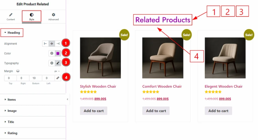
1. Alignment: You can adjust the heading position to left, center or right with this option.
2. Color: You can change the heading text color with this option.
3. Typography: Change the font family, size, weight, transform, style, decoration, line height, letter spacing, and word spacing from here.
4. Margin: You can adjust the space around the field with this option.
Items Section #
Go to Style → Items
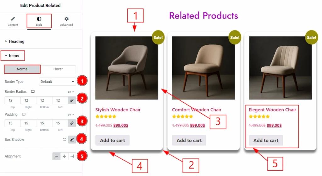
In this section, we have two more tabs. These are Normal & Hover. Let’s start with the Normal Tab first –
1. Border Type: You can add and change the border types with this option.
2. Border Radius: You can control the roundness of the border with this option.
3. Padding: You can adjust the inner space of the item field with this option.
4. Box Shadow: You can add a shadow effect to the items with this option.
5. Alignment: You can set the content position of the items with this option.
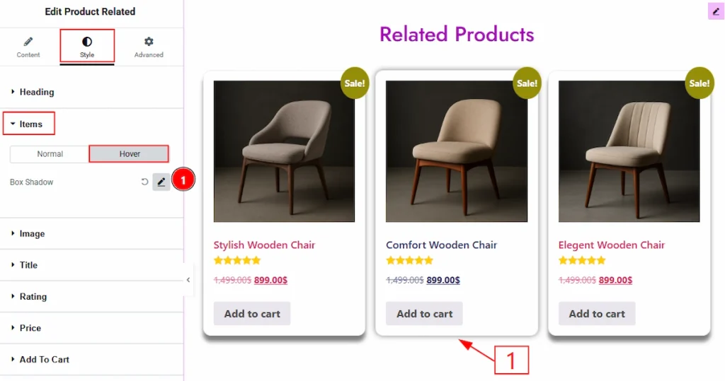
Now, let’s proceed to the Hover tab –
1. Border Color: You can make changes to the border hover color with this option.
2. Box Shadow: You can add a hover shadow effect to the items with this option.
Image Section #
Go to Style → Image
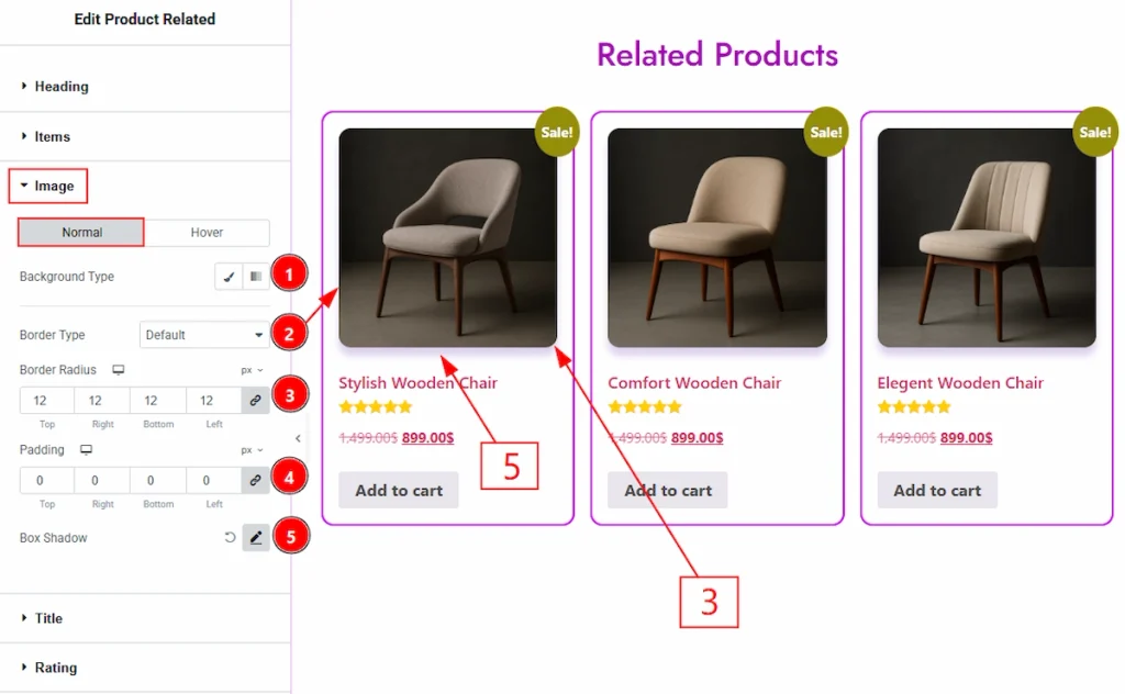
In this section, we have two more tabs. These are Normal & Hover. Let’s start with the normal tab first –
1. Background Type: You can change the background type to be classic or gradient with this option. Here, we have selected the background type as Classic.
2. Border Type: You can add and change the border types with this option.
3. Border Radius: You can control the roundness of the border with this option.
4. Padding: You can adjust the inner space with this option.
5. Box Shadow: You can add a shadow effect to the image with this option.
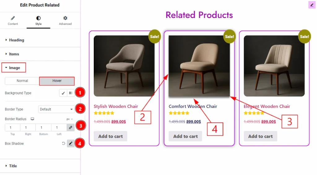
Now, let’s proceed to the Hover tab –
1. Background Type: You can change the background type to be classic or gradient with this option. Here, we have selected the background type as Classic.
2. Border Type: You can add and change the border types with this option.
3. Border Radius: You can control the roundness of the border with this option.
4. Box Shadow: You can add a hover shadow effect to the image with this option.
Title Section #
Go to Style → Title
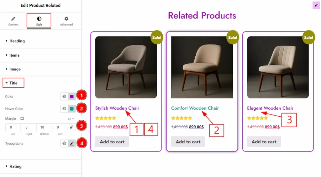
1. Color: You can make changes to the title text with this option.
2. Hover Color: You can make changes to the title text hover color with this option.
3. Margin: You can adjust the space around the title field with this option.
4. Typography: Change the font family, size, weight, transform, style, decoration, line height, letter spacing, and word spacing from here.
Rating Section #
Go to Style → Rating
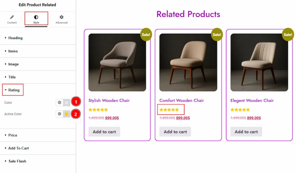
1. Color: You can change the star unfilled color with this option.
2. Active Color: You can make changes to the filled start color with this option.
Note: If you have ratings that are not 5 start only then you will be able to see the normal color for the rating star.
Price Section #
Go to Style → Price
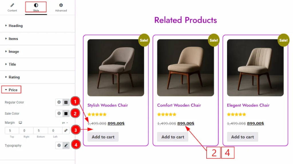
1. Regular Color: You can make changes to the regular price color with this option.
2. Sale Color: You can make changes to the sale price color with this option.
3. Margin: You can adjust the space around the field with this option.
4. Typography: Change the font family, size, weight, transform, style, decoration, line height, letter spacing, and word spacing from here.
Add To Cart Section #
Go to Style → Add To Cart
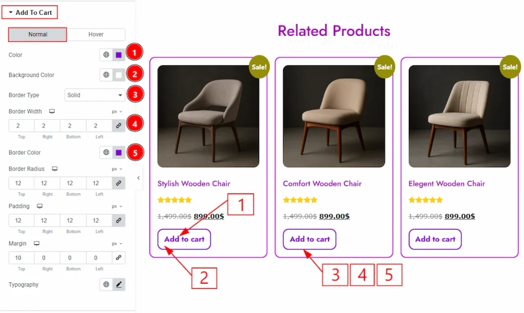
In this section, we have two more tabs. These are Normal & Hover. Let’s start with the Normal tab first –
1. Color: You can make changes to the add to cart button text color with this option.
2. Background Color: You can make changes to the button’s background color with this option.
3. Border Type: You can add and change the border types with this option.
4. Border Width: You can set the thickness of the border with this option.
5. Border Color: You can change the border color with this option.
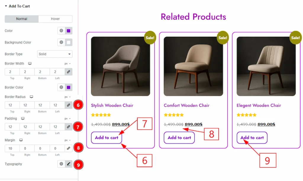
6. Border Radius: You can control the roundness of the border with this option.
7. Padding: You can adjust the inner space with this option.
8. Margin: You can adjust the space around the field with this option.
9. Typography: Change the font family, size, weight, transform, style, decoration, line height, letter spacing, and word spacing from here.
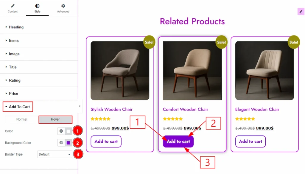
Now, let’s proceed to the Hover Tab –
1. Color: You can make changes to the button’s text hover color with this option.
2. Background Color: You can make changes to the background color hover color with this option.
3. Border Type: You can change the border type and change it’s color with this option.
Sale Flash Section #
Go to Style → Sale Flash
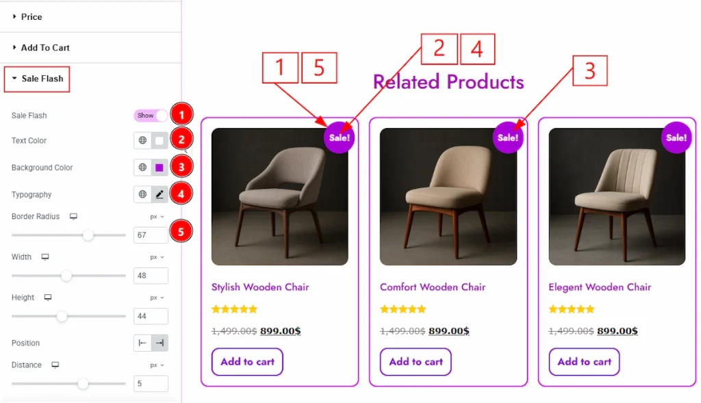
1. Sale Flash: Enable the switcher to add and show more options to customize the sale flash with this option.
2. Text Color: You can make changes to the sale flash badge text color with this option.
3. Background Color: You can make changes to the background color with this option.
4. Typography: Change the font family, size, weight, transform, style, decoration, line height, letter spacing, and word spacing from here.
5. Border Radius: You can control the roundness of the border with this option.
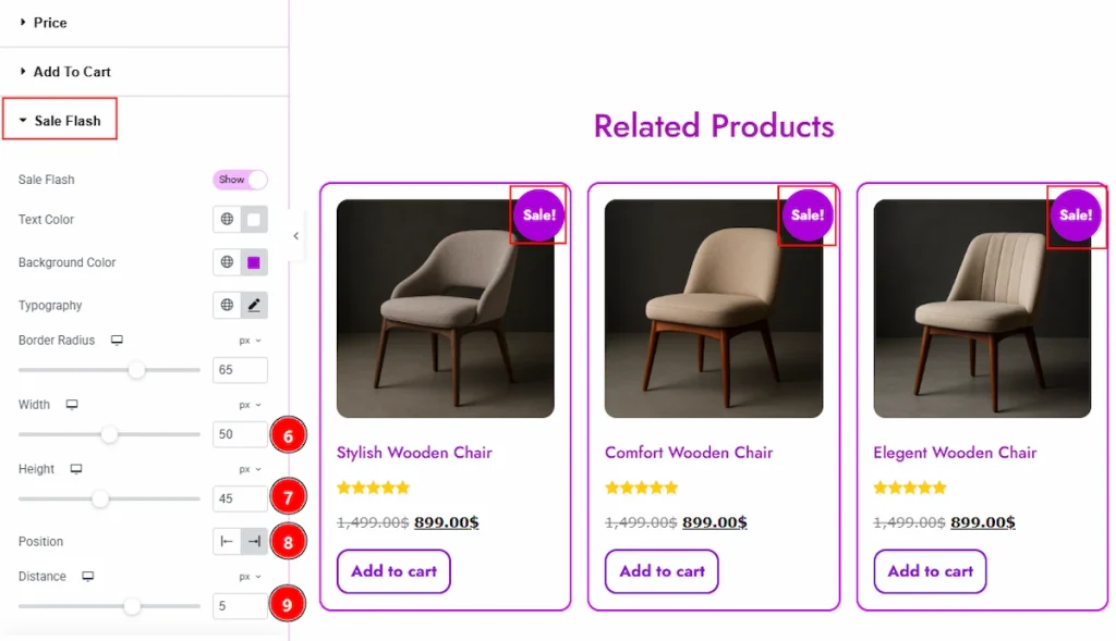
6. Border Width: You can set the thickness of the border with this option.
7. Height: You can adjust the badge height with this option.
8. Position: You can set the badge position to left or right with this option.
9. Distance: You can set change the badge position and move it with this option.
All done! You have successfully customized the Product Related widget on your website.
Video Assist #
You can also watch the video tutorial to learn more about the Product Related Widget. Please visit the demo page for examples.
Thanks for being with us.