



The Accordion widget from Wow Elements allows you to display content in collapsible sections in a clean and organized way. It’s perfect for presenting FAQs, feature details, or structured information while saving space and improving user experience. With flexible styling and layout options, you can easily customize each accordion item to match your website design. This guide will walk you through how to use and customize the Accordion widget in Elementor.
Enable The Accordion Widget #
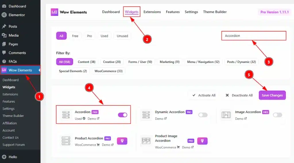
To use the Accordion widget from Wow Elements, first, you have to enable the widget.
- Go to WordPress dashboard → Wow Elements Plugin dashboard.
- Then, Click the Core Widgets Tab.
- Search the Accordion Widget Name.
- Enable the Accordion Widget.
- Hit the Save Settings Button.
Inserting The Accordion Widget #
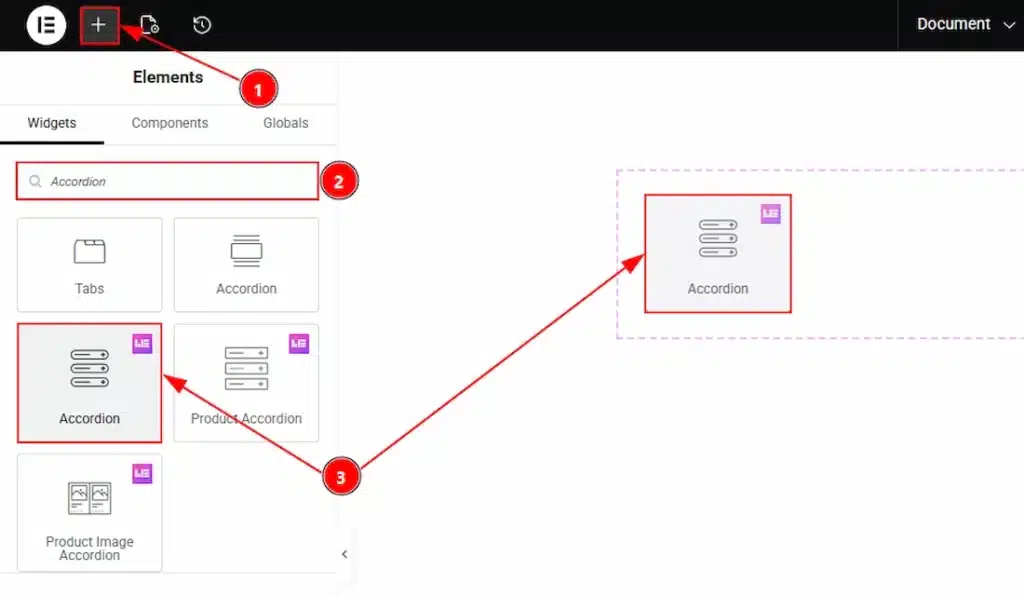
1. Go to the Elementor Editor Page and hit the “+” icon Button.
2. Search the Accordion name.
3. Drag the widget and drop it on the editor page.
Work With The Content Tab #
Accordion Section #
Go to Content → Accordion
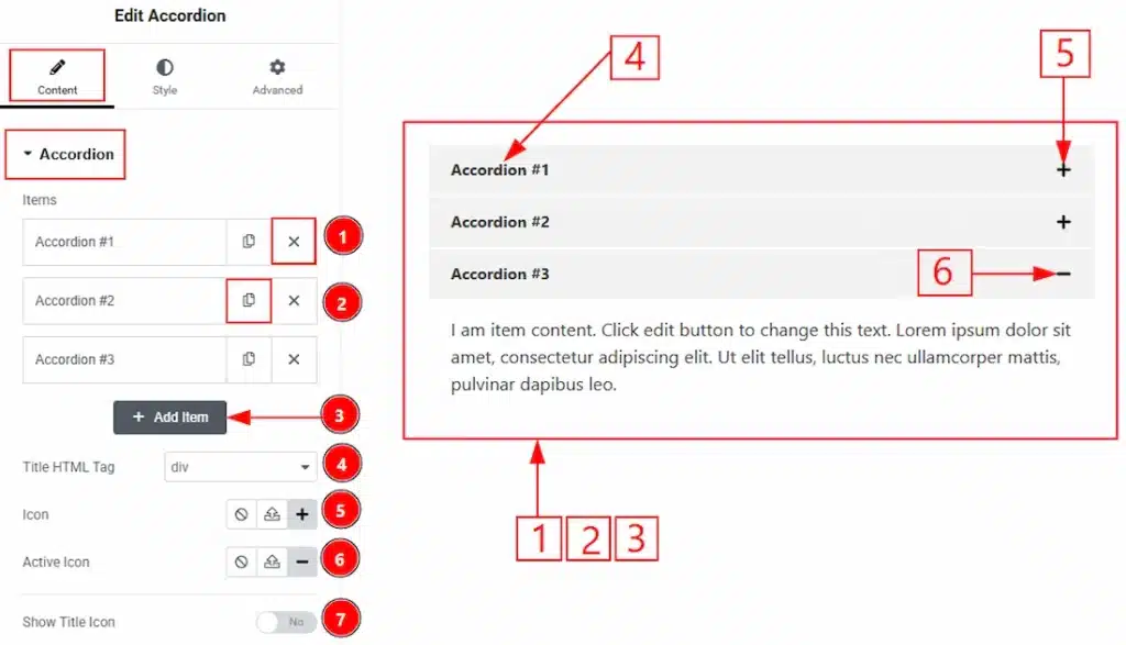
1. Close Button: You can click on the close button to close the accordion items with this option.
2. Copy Button: You can click on the copy button to copy exact same item or duplicate the brand item with this option.
3. Add Item: You can click on this button to add more accordion items.
4. Title HTML Tag: You can select the HTML Tag for the title with this option.
5. Icon: You can make changes to the item expand icon with this option.
6. Active Icon: You can make changes to the active icon with this option.
7. Show Title Icon: You can enable the switcher to show the icon to the title with this option.
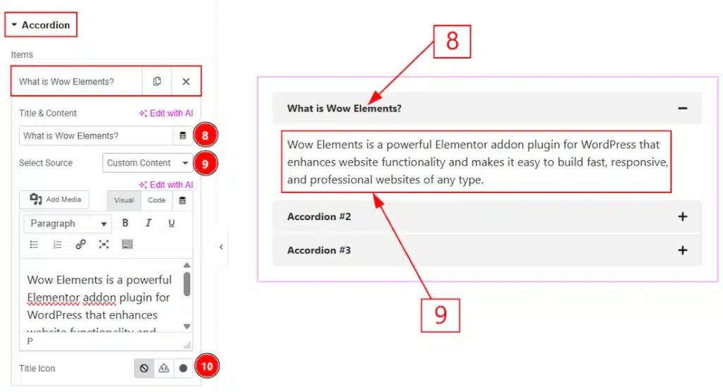
In each accordion item, we have more options to customize. Let’s start describing those options –
8.Title & Content: You can add the accordion item title content in this field.
9. Select Source: You can select the source here from where you can get the content. By selecting the custom content, you need to add the content manually.
10. Title Icon: You can add and make changes to the title icon with this option.
Additional Settings Section #
Go to Content → Additional Settings
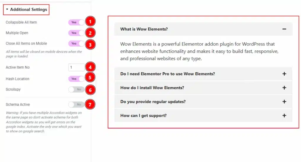
1. Collapsible All Item: Enable the switcher to make all the accordion items collapsible.
2. Multiple Open: Enable the switcher to open the accordion items multiple at a same time.
3. Close All Items on Mobile: Enable the switcher to close all the items on mobile device.
4. Active Item No: You can select the accordion item number which you want to open while the page loaded.
5. Hash Location: Enable the switcher to enables a unique URL hash for each accordion item, allowing users to link directly to a specific section (e.g., #item1) and open it automatically.
6. Scrollspy: Enable the switcher to automatically updates the active accordion item based on the user’s scroll position, helping indicate which section is currently in view.
7. Schema Active: Enable the switcher to add structured data (schema markup) to the accordion content, improving SEO and helping search engines better understand and display your content (especially useful for FAQs).
Work with The Style Tab #
Item Section #
Go to Style → Item
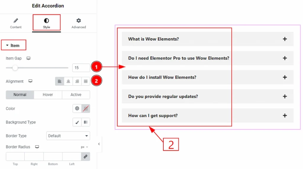
1. Item Gap: You can adjust the space between the accordion items with this option.
2. Alignment: You can set the position of the title content to left, center, right or justified with this option.
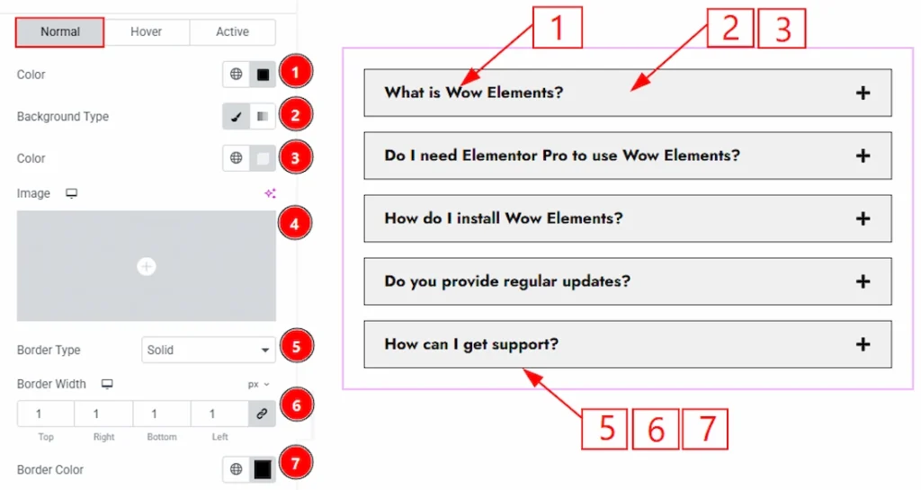
In this section, we have three more tabs. These are Normal, Hover & Active. Let’s start with the Normal tab first –
1. Color: You can make changes to the item title content text color with this option.
2. Background Type: You can choose the background type to be classic or gradient with this option. Here we have selected the background type as Classic.
3. Color: You can change the background color with this option.
4. Image: You can change the background image with this option.
5. Border Type: You can add and change the border types with this option.
6. Border Width: You can set the thickness of the border with this option.
7. Border Color: You can change the border color with this option.
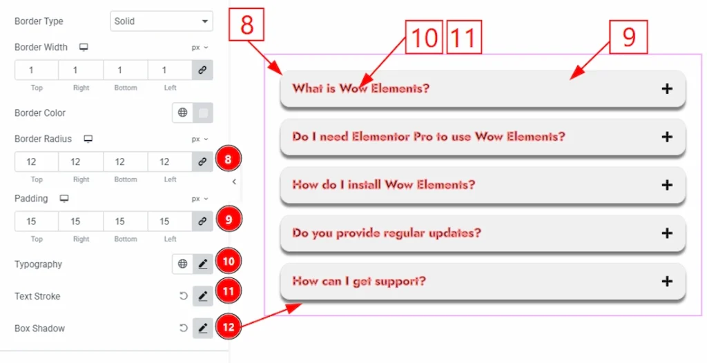
8. Border Radius: You can control the roundness of the border with this option.
9. Padding: You can adjust the inner space of the Accordion field with this option.
10. Typography: Change the font family, size, weight, transform, style, decoration, line height, letter spacing, and word spacing from here.
11. Text Stroke: You can add a stroke to the text and customize it with this option.
12. Box Shadow: You can add a shadow effect to the Accordion items with this option.
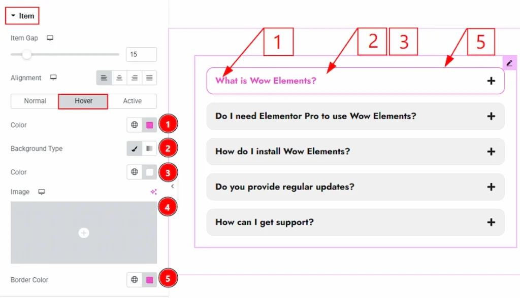
Now, let’s proceed to the Hover Tab –
1. Color: You can make changes to the item title text hover color with this option.
2. Background Type: You can choose the background type to be classic or gradient with this option. Here we have selected the background type as Classic.
3. Color: You can change the background hover color with this option.
4. Image: You can change the background image with this option.
5. Border Color: You can change the border hover color with this option.
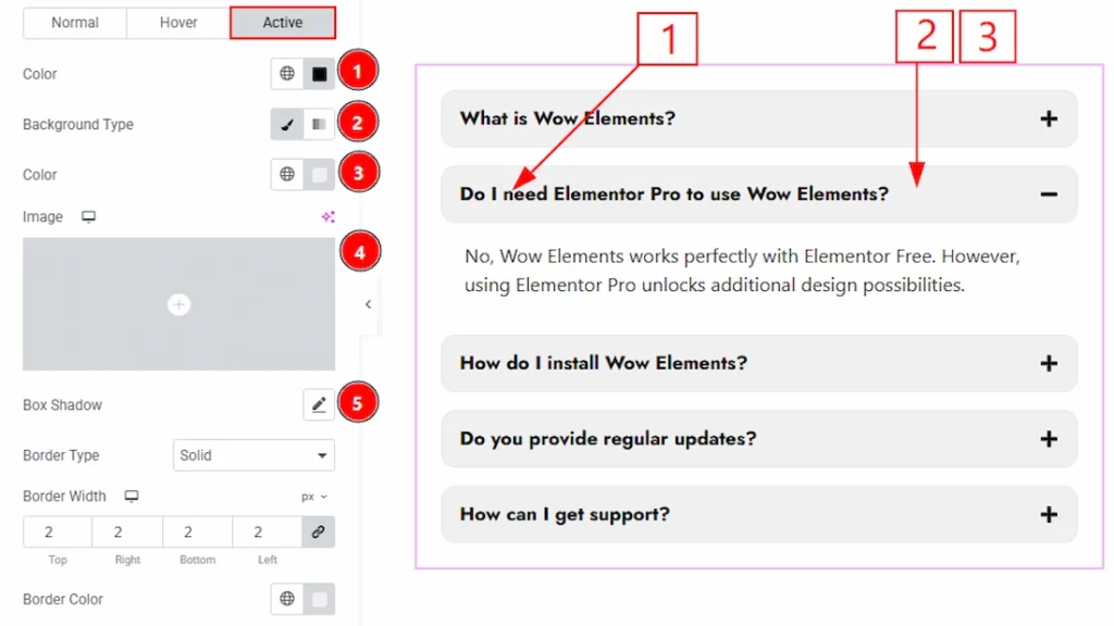
Now let’s proceed with the Active tab –
1. Color: You can change the accordion item title text active color with this option.
2. Background Type: You can change the background type to be classic or gradient with this option.
3. Color: You can change the active background color with this option.
4. Image: You can change the background image with this option.
5. Box Shadow: You can add a shadow effect to the accordion item’s active title text with this option.
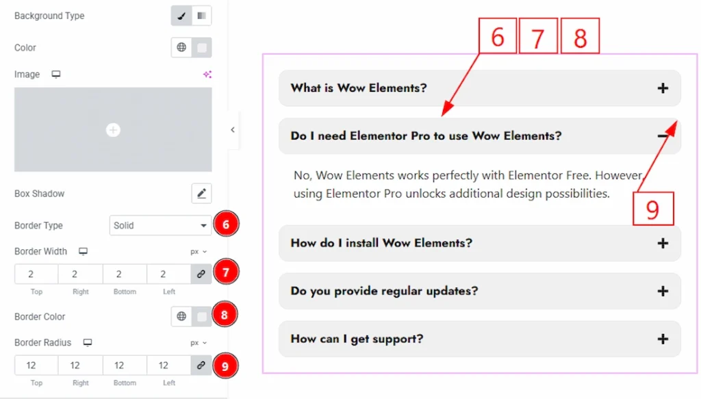
6. Border Type: You can add and change the border type with this option.
7. Border Width: You can set the thickness of the border with this option.
8. Border Color: You can change the border color with this option.
9. Border Radius: You can control the roundness of the border with this option.
Open & Close Icon Section #
Go to Style → Open & Close Icon
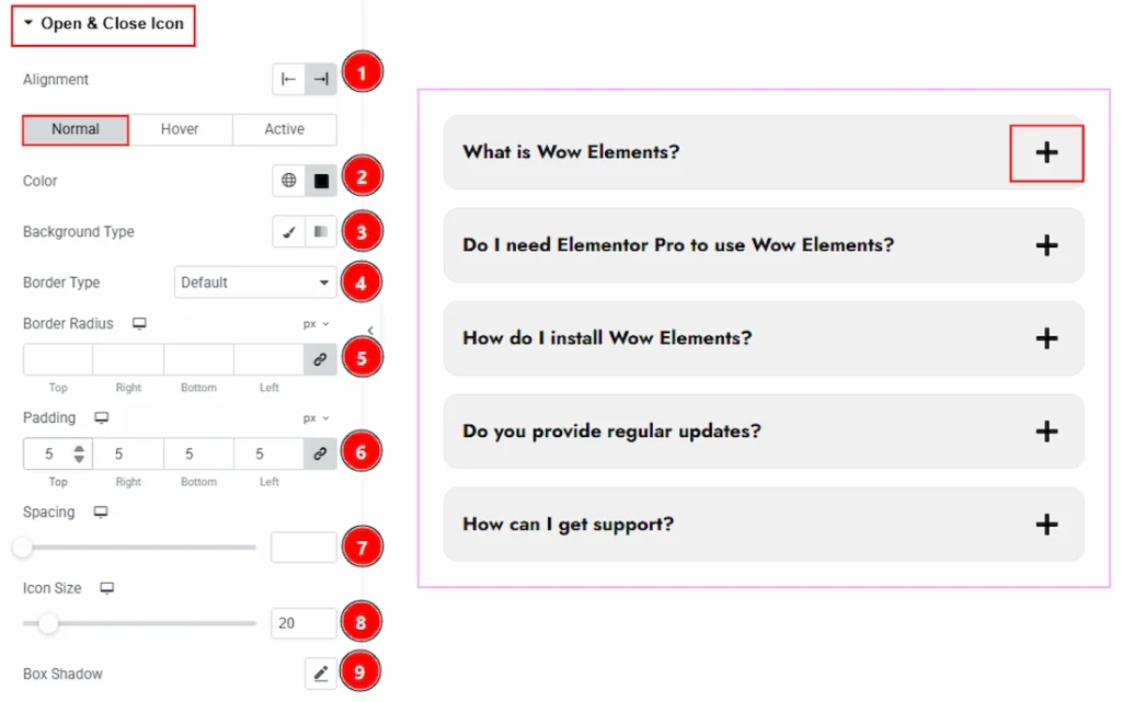
In this section, we have three more tabs. These are Normal, Hover & Active. Let’s start with the Normal Tab first –
1. Alignment: You can move the icon position to left or right with this option.
2. Color: You can make changes to the open & close icon color with this option.
3. Background Type: You can choose the background type to be classic or gradient with this option.
4. Border Type: You can add and change the border types with this option.
5. Border Radius: You can control the roundness of the border with this option.
6. Padding: You can adjust the inner space of the Accordion item’s open & close icon field with this option.
7. Spacing: You can adjust the space with this option.
8. Icon Size: You can adjust the open & close icon size with this option.
9. Box Shadow: You can add a shadow effect to the hours Accordion item with this option.
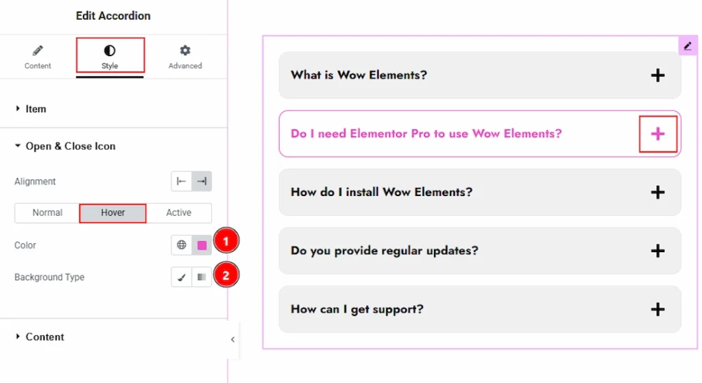
Now let’s proceed with the Hover tab –
1. Color: You can change the open & close icon hover color with this option.
2. Background Type: You can change the background type to be classic or gradient with this option.
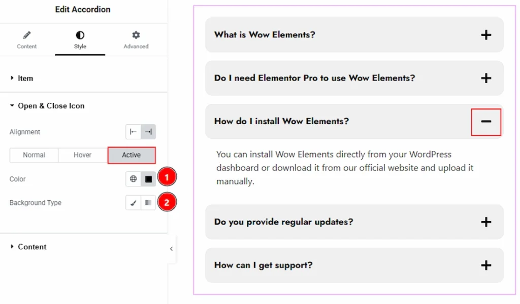
Now, let’s proceed with the Active tab-
1. Color: You can change the open & close icon active color with this option.
2. Background Type: You can choose the background type to be classic or gradient with this option.
Content Section #
Go to Style → Content
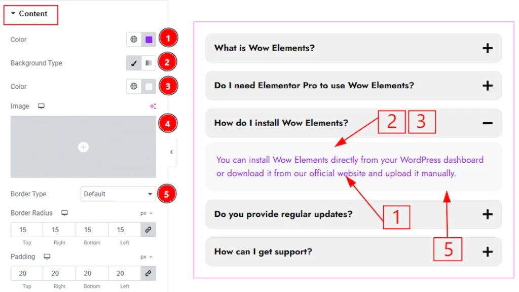
1. Color: You can make changes to the content text color with this option.
2. Background Type: You can choose the background type to be classic or gradient with this option. Here we have selected the background type as Classic.
3. Color: You can change the background color with this option.
4. Image: You can change the background image with this option.
5. Border Type: You can add and change the border types with this option.
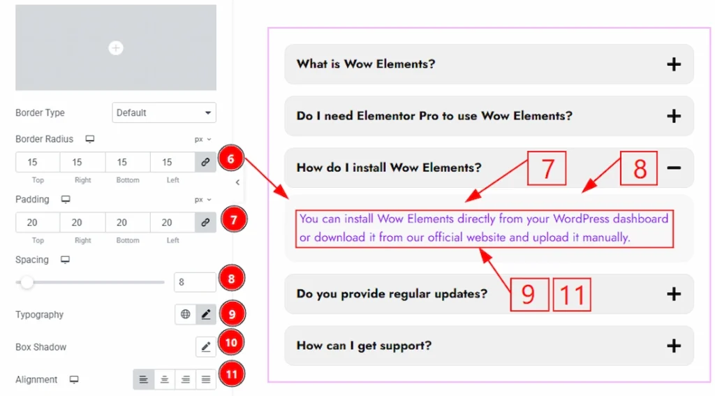
6. Border Radius: You can control the roundness of the border with this option.
7. Padding: You can adjust the inner space of the Accordion item content field with this option.
8. Spacing: You can adjust the space between the title field and the content field with this option.
9. Typography: Change the font family, size, weight, transform, style, decoration, line height, letter spacing, and word spacing from here.
10. Box Shadow: You can add a shadow effect to the minutes Accordion item with this option.
11. Alignment: You can adjust the content position to left, center, right or justify with this option.
All done! You have successfully customized the Accordion widget on your website.
Video Assist #
You can also watch the video tutorial to use the Accordion widget. The video is coming soon. Please visit the demo page for examples.