


The Mega Menu widget from Wow Elements Pro for Elementor lets you create advanced and customizable navigation menus with ease. It allows you to organize multiple menu items, columns, and rich content within a structured dropdown layout, improving navigation and user experience. With flexible styling and layout controls, you can design responsive mega menus that match your website. This documentation will guide you on how to use and customize the Mega Menu widget in Wow Elements Pro.
Enable The Mega Menu Widget #
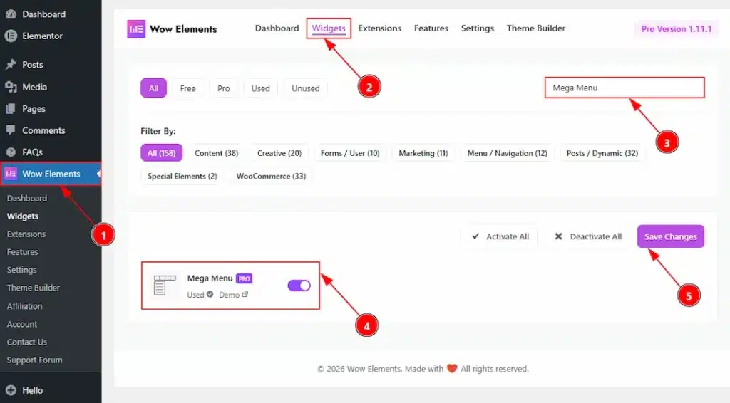
To use the Mega Menu widget from Wow Elements Pro –
- Go to WordPress dashboard → Wow Elements Plugin dashboard.
- Then, Click the Widgets Tab.
- Search for the Mega Menu widget.
- Enable the Mega Menu Widget.
- Hit the Save Settings Button.
Note: After enable the mega menu you need to create a menu first to show to your elementor editor. Please see this doc to learn how to create a mega menu. You need to enable the feature as well to create the mega menu.
Inserting The Mega Menu Widget #
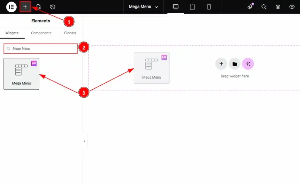
1. Go to the Elementor Editor Page and hit the “+” icon Button.
2. Search the Mega Menu name.
3. Drag the Feature and drop it on the editor page.
Content Tab Overview #
Layout Section #
Go to Content → Layout
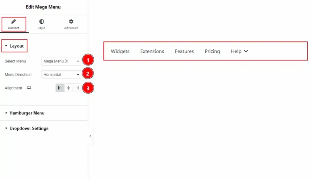
1. Select Menu: You can select the menu that you have created on the appearance with this option. Here we have created one and input that.
2. Menu Direction: You can select the direction style of the menu with this option. The available directions are Horizontal & Vertical. If you select the horizontal menu direction, you will see the upper visual.
3. Alignment: You can set the horizontal menu position to left, center or right with this option.
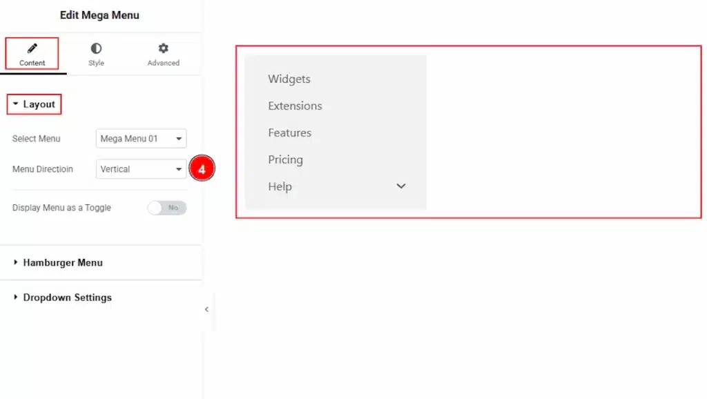
4. Menu Direction: If you have selected the menu direction as vertical you will get to see the upper visual.
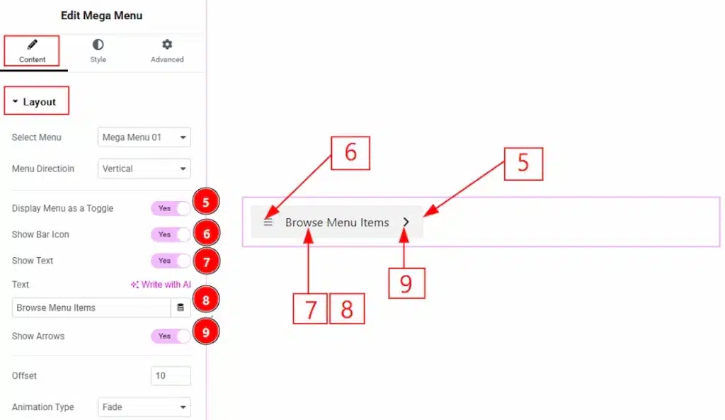
5. Display Menu as a Toggle: Enable the switcher to show the vertical menu as a toggle.
6. Show bar Icon: Enable the switcher to show the bar icon on the vertical toggle menu.
7. Show Text: Enable the switcher to show the text on the vertical toggle menu.
8. Text: You can make changes to the text that will visible to the toggle vertical menu with this option.
9. Show Arrows: Enable the switcher to show the arrow icon on the toggle vertical menu.
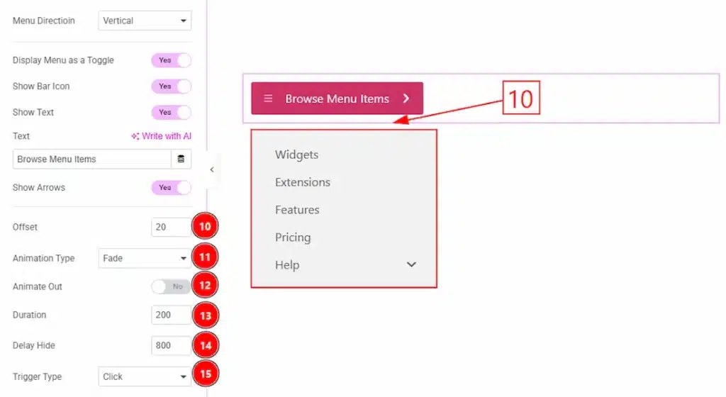
10. Offset: You can adjust the space vertically between the toggle and the dropdown content with this option.
11. Animation Type: You can select the animation type that will happen while the dropdown content is open.
12. Animate Out: Enable the feature to animate while closing the dropdown content.
13. Duration: This option defines how long the closing animation takes.
14. Delay Hide: You can add a delay time (in milliseconds) before the menu starts closing after the trigger is lost (e.g., mouse leaves).
15. Trigger Type: You can select how the dropdown content will appear with this option. The available trigger types are on click & on hover.
Hamburger Menu Section #
Go to Content → Hamburger Menu
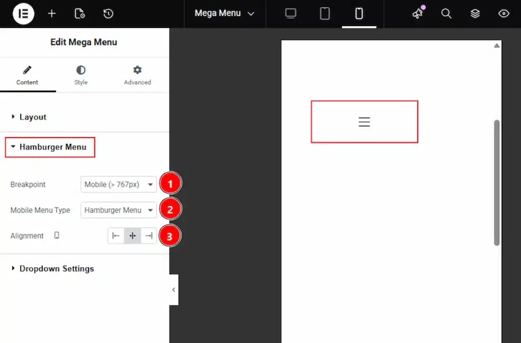
1. Breakpoint: This option defines the screen size at which the mega menu converts into a hamburger menu. You can select between the Tablet, Mobile & None.
2. Mobile Menu Type: This option allows you to choose the mobile menu type as Hamburger Menu or Offcanvas Menu. If you select the mobile menu type as Hamburger, you will see the upper visual.
3. Alignment: You can adjust the position of the hamburger menu icon with this option.
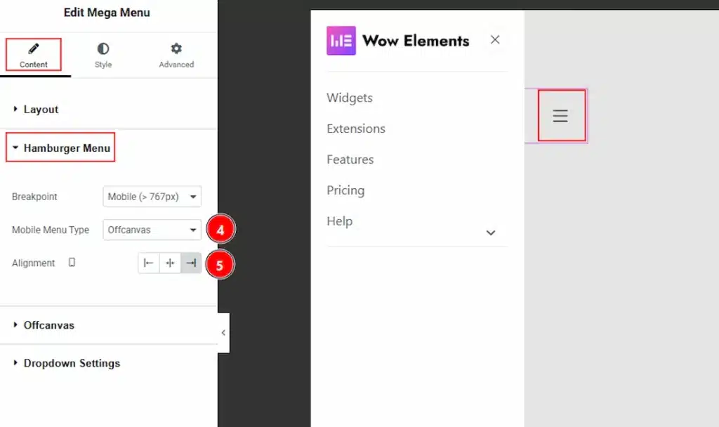
4. Mobile Menu type: If you select the mobile menu type as Offcanvas, you will see the upper visual of the menu bar.
5. Alignment: You can adjust the position of the off-canvas mobile menu icon with this option.
Offcanvas Section #
Go to Content → Offcanvas
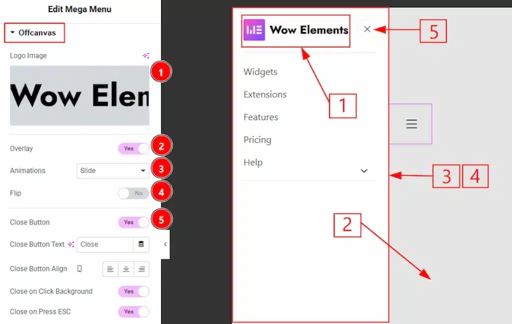
1. Logo Image: You can ad logo image to your offcanvas menu with this option.
2. Overlay: Enable the switcher to create a semi-transparent background overlay behind the off-canvas panel.
3. Animation: This option controls how the off-canvas menu enters and exits the screen. You can select the animation style between slide, push, reveal & none.
4. Flip: Enable the switcher to allow the off-canvas panel to open from the opposite direction (for example, right instead of left)
5. Close Button: Enable the switcher to show the close button to your audience.
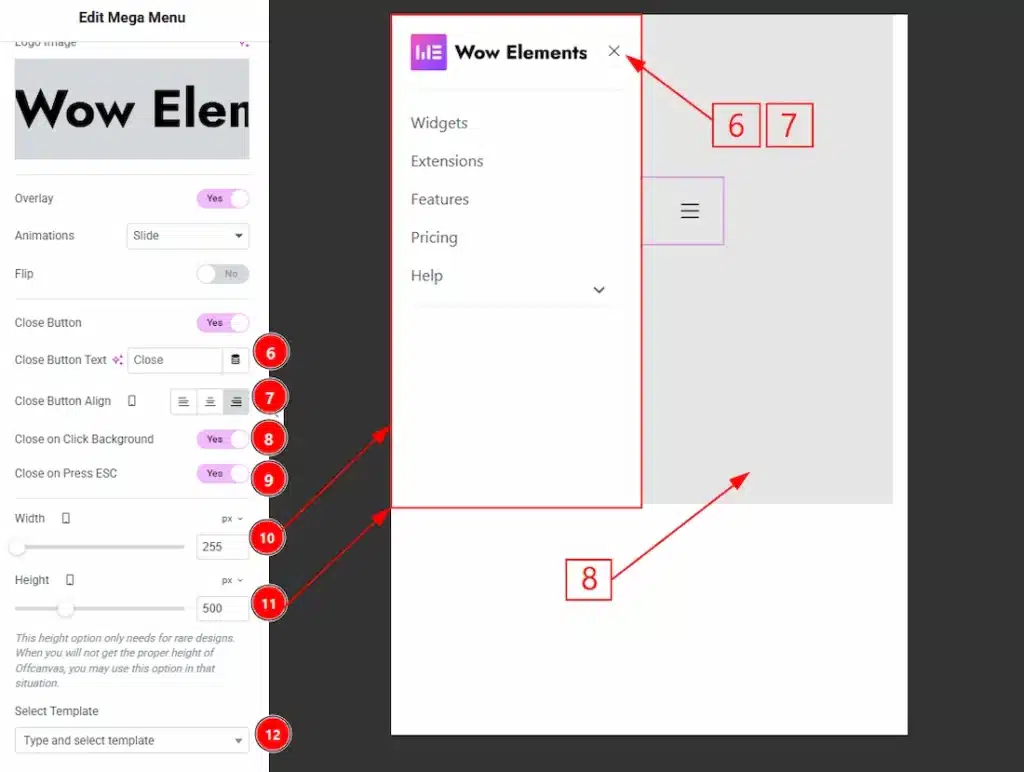
6. Close Button Alignment: This option defines the alignment of the close button within the off-canvas panel. You can choose between left, center, or right.
7. Close on Click Background: When enabled, clicking on the overlay/background outside the off-canvas panel will close the menu.
8. Close on Press Esc: Enable the switcher to allow users to close the off-canvas menu by pressing the Esc key on their keyboard.
9. Width: You can adjust the width of the off-canvas panel with this option.
10. Height: You can adjust the height of the off-canvas panel with this option.
11. Select Template: This option lets you choose an Elementor template to load inside the off-canvas menu.
Dropdown Settings Section #
Go to Content → Dropdown Settings
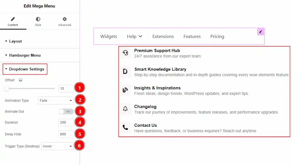
1. Offset: You can adjust the space vertically between the menu and the dropdown content with this option.
2. Animation Type: You can select the animation type that will happen while the dropdown content is open & close with this option. Choose the animation type from this option.
3. Animate Out: Enable the feature to animate while closing the dropdown content.
4. Duration: This option defines how long the closing animation takes.
5. Delay Hide: You can add a delay time (in milliseconds) before the menu starts closing after the trigger is lost (e.g., mouse leaves).
6. Trigger Type: You can select how the dropdown content will appear with this option. The available trigger types are on click & on hover.
Style Tab Overview #
Menu Items Section #
Go to Style → Menu Items
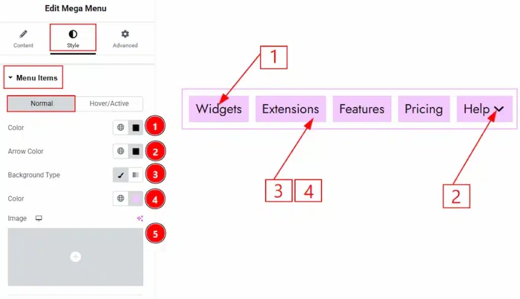
In this section, we have two more tabs. These are Normal & Hover. Let’s start describing the Normal Tab first –
1. Color: You can change the mega menu items text color with this option.
2. Arrow Color: You can make changes to the arrow color with this option.
3. Background Type: You can select the background type as classic or gradient with this option. Here we have selected the background type as classic.
4. Color: You can change the menu items background color with this option.
5. Image: You can add and make changes to the background image with this option.
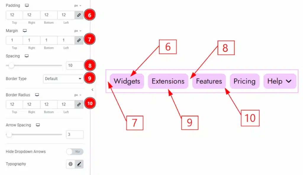
6. Padding: You can adjust the inner space of the menu items with this option.
7. Margin: You can adjust the space around the menu items with this option.
8. Spacing: You can adjust the space between the menu items with this option.
9. Border Type: You can add and change the border type of the menu items with this option.
10. Border Radius: This option controls the roundness of the border.
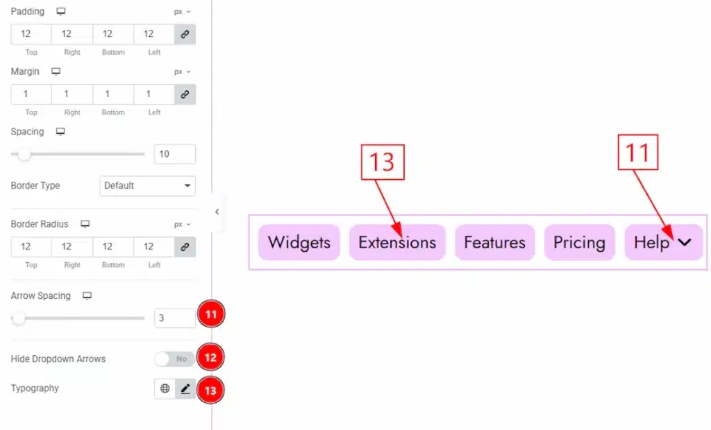
11. Arrow Spacing: You can adjust the space between the menu items and the dropdown arrow with this option.
12. Hide Dropdown Arrows: Enable the switcher to remove the dropdown arrow icon from the menu items.
13. Typography: Change the font family, size, weight, transform, style, decoration, line height, letter spacing, and word spacing from here.
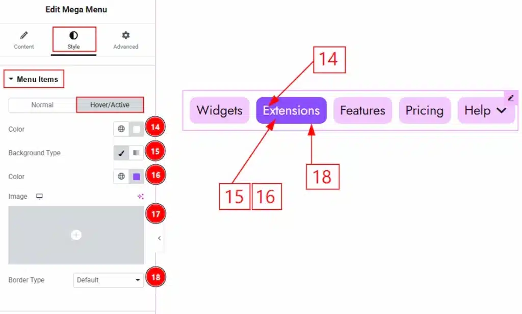
Now let’s proceed to the Hover Tab –
14. Color: You can change the menu items text hover color with this option.
15. Background Type: You can choose the background type from classic or gradient with this option.
16. Color: You can change the menu items background hover color with this option.
17. Image: You can add or change the background hover image with this option.
18. Border Type: You can add & customize the item border with this option.
Dropdown Section #
Go to Style → Dropdown
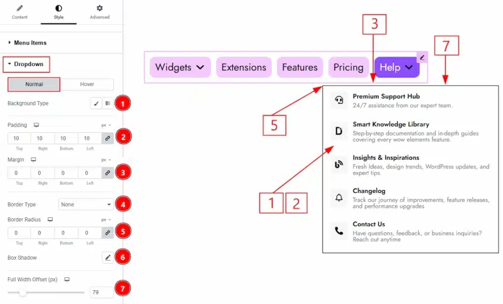
In this section, we have two more tabs. These are Normal & Hover. Let’s start with the Normal Tab first
1. Background Type: You can change the background type to classic or gradient with this option.
2. Padding: You can adjust the inner space of the dropdown popup with this option.
3. Margin: You can adjust the space around the dropdown popup with this option.
4. Border Type: You can add & customize the border of the dropdown panel with this option.
5. Border Radius: This option controls the roundness of the border.
6. Box Shadow: You can add a shadow effect to the dropdown content with this option.
7. Full Width Offset: You can move the dropdown content panel horizontally with this option.
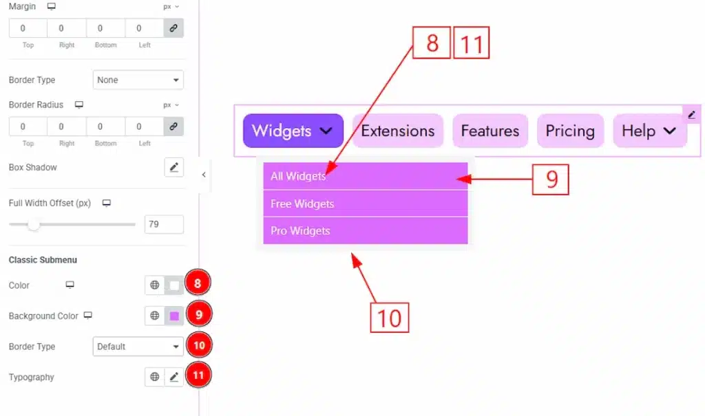
10. Color: You can make changes to the submenu text color with this option.
11. Background Color: You can change the background color of the submenu with this option.
12. Border Type: You can choose the border type of the submenu and change its type with this option.
13. Typography: Change the font family, size, weight, transform, style, decoration, line height, letter spacing, and word spacing from here.
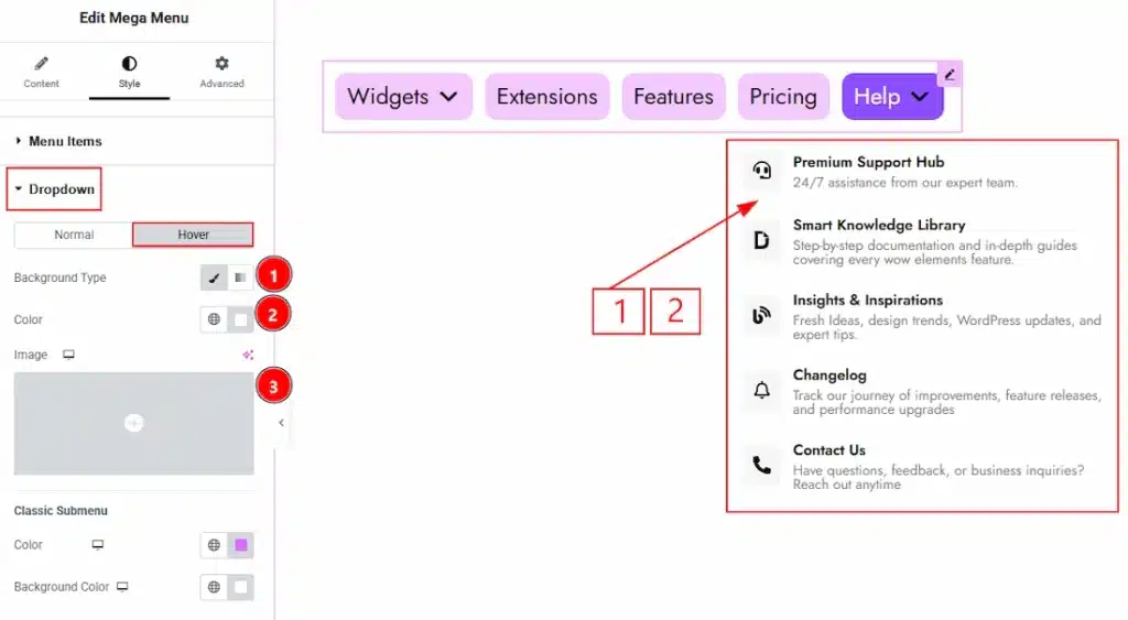
Now let’s proceed to the Hover Tab –
1. Background Type: You can change the background type to be classic or gradient with this option.
2. Color: You can change the background hover color with this option.
3. Image: You can change the background image with this option.
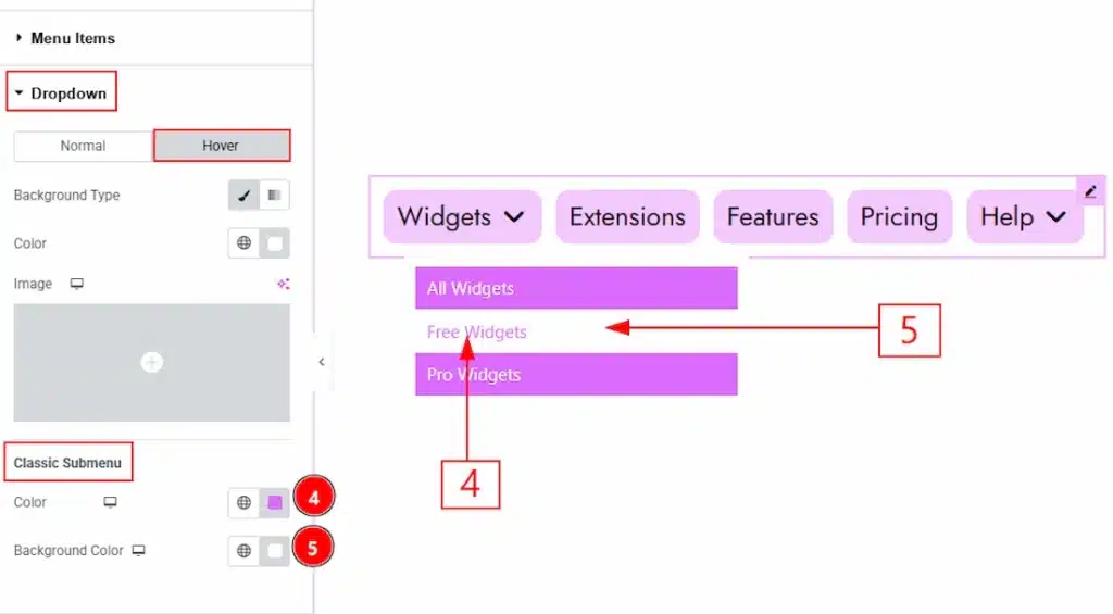
4. Color: You can change the text hover color with this option.
5. Background Color: You can change the background hover color with this option.
Hamburger Menu Section #
Go to Style → Hamburger Menu
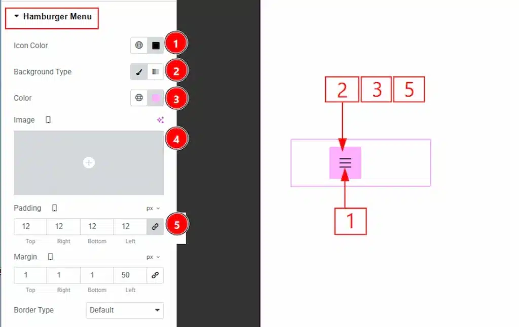
1. Icon Color: You can choose the icon color with this option.
2. Background Type: You can choose the background type as Classic or gradient with this option.
3. Color: You can choose the background color with this option.
4. Image: You can add a background image with this option.
5. Padding: You can adjust the inner space of the hamburger icon with this option.
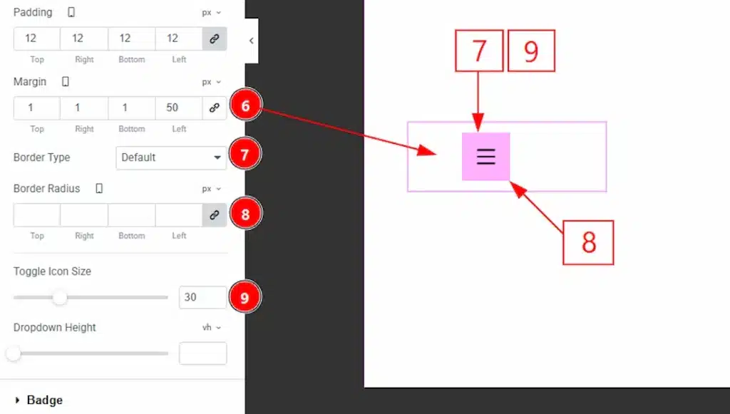
6. Margin: You can adjust the space of the hamburger icon’s outer space with this option.
7. Border Type: You can add and choose the border type with this option.
8 Border Radius: You can control the roundness of the border with this option.
9. Toggle Icon Size: You can adjust the hamburger toggle icon size with this option.
10. Dropdown Height: You can adjust the height of the hamburger dropdown content with this option.
Offcanvas Section #
Go to Style → Offcanvas
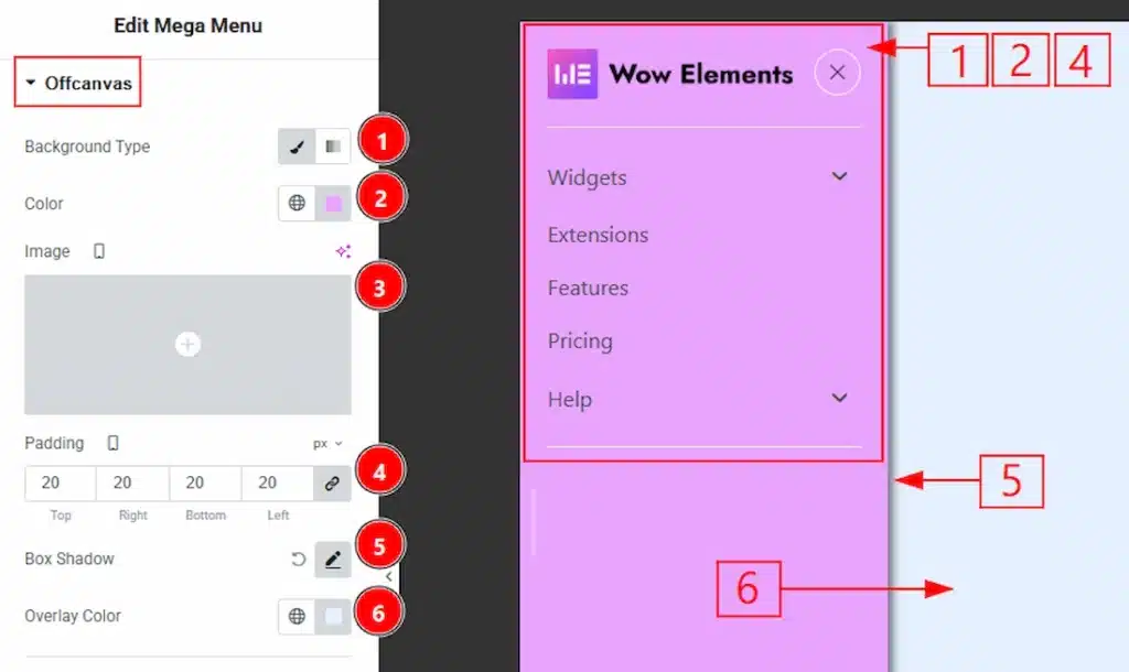
1. Background Type: You can choose the background type as classic or gradient with this option.
2. Color: You can change the background color with this option.
3. Image: You can change the background image with this option.
4. Padding: You can adjust the inner space of the off-canvas menu content with this option.
5. Box Shadow: You can add and customize the shadow effect to the off-canvas bar with this option.
6. Overlay Color: You can make changes to the overlay color with this option.
In this section, we have three more sub-sections. These are Header, Close Icon & Footer. Let’s start describing the sub-sections one by one.
Header Sub Section #
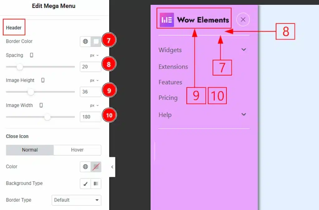
7. Border Color: You can make changes to the off-canvas border color with this option.
8. Spacing: You can adjust the space between the header border & the image with this option.
9. Image Height: You can adjust the height of the logo image with this option.
10. Image Width: You can adjust the width of the logo image with this option.
Close Icon Sub Section #
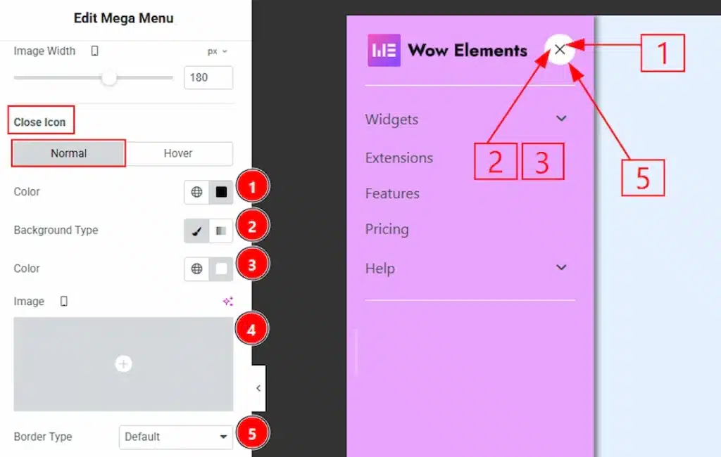
In this section, we have two more tabs. These are Normal & Hover. Let’s start customizing the Normal Tab first –
1. Color: You can make changes to the close icon color with this option.
2. Background Type: You can choose the background between classic or gradient with this option.
3. Color: You can change the background color of the close icon with this option.
4. Image: You can change the background image of the close icon with this option.5. Border Type: You can add or change the border type with this option.
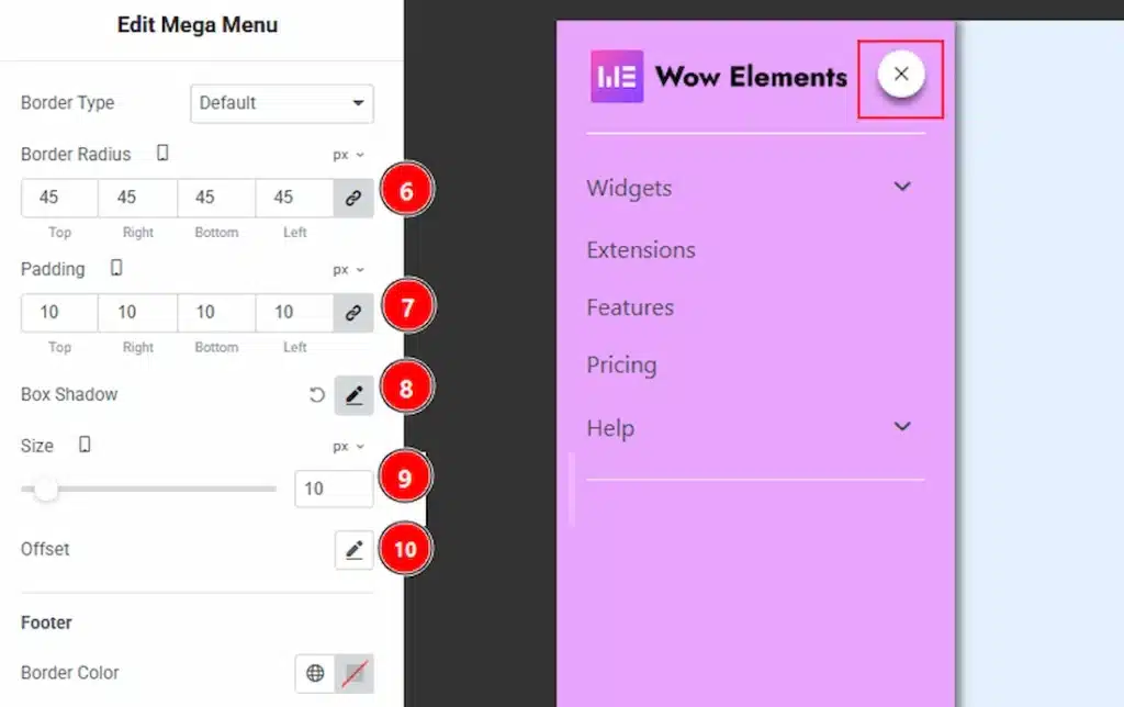
6. Border Radius: You can control the roundness of the border with this option.
7. Padding: You can adjust the inner space of the close icon button with this option.
8. Box Shadow: You can add & customize shadow effect with this option.
9. Size: You can adjust the size of the close icon with this option.
10. Offset: You can move the close icon horizontally & vertically with this option.
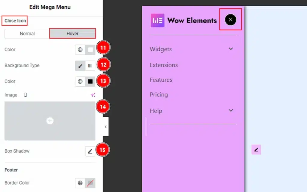
Now, let’s proceed to the Hover Tab –
11. Color: You can change the close icon hover color with this option.
12. Background Type: You can choose the background type between classic and gradient with this option.
13. Color: You can change the close icon background hover color with this option.
14. Image: You can change the background image with this option.
15. Box Shadow: You can add a hover shadow effect to the close icon with this option.
Footer Sub Section #
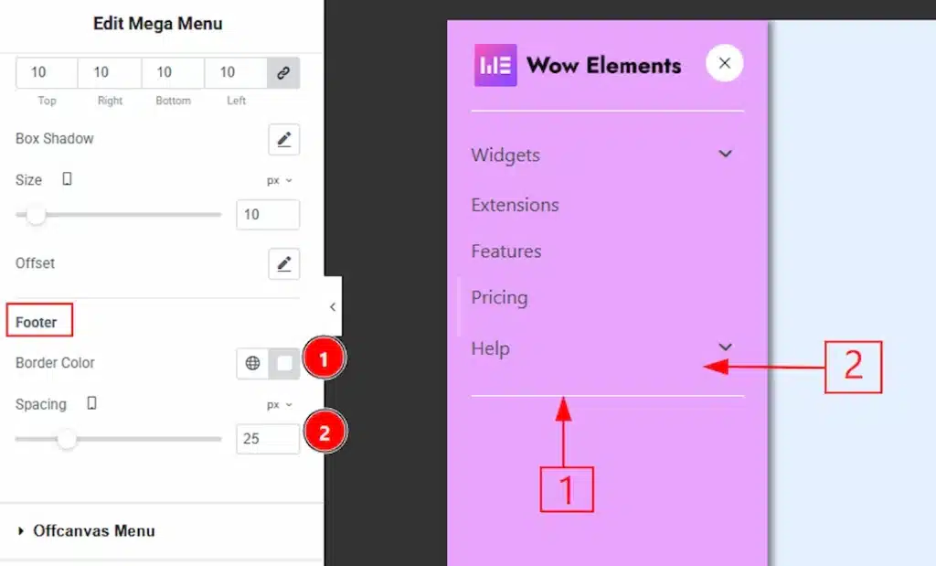
1. Border Color: You can change the footer border color with this option.
2. Spacing: You can adjust the space between the menu & footer border with this option.
Offcanvas Menu Section #
Go to Style → Offcanvas Menu
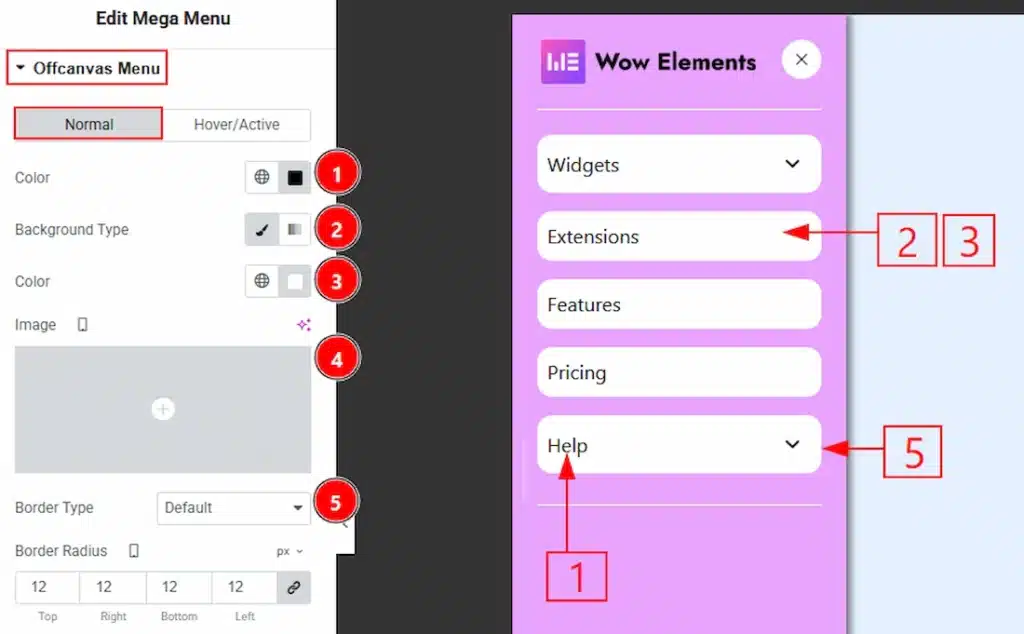
In this section, we have two more tabs. These are Normal & Hover. Let’s start with the Normal Tab first –
1. Color: You can change the off-canvas menu text color with this option.
2. Background Type: You can choose the background type between classic or gradient with this option.
3. Color: You can change the background color with this option.
4. Image: You can change the background image with this option.
5. Border Type: You can add and change border types with this option.
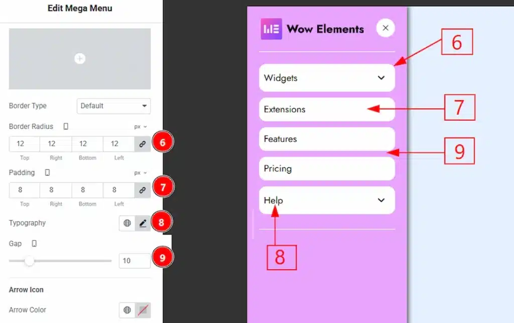
6. Border Radius: You can control the roundness of the border with this option.
7. Padding: You can adjust the inner space of the menu text field with this option.
8. Typography: Change the font family, size, weight, transform, style, decoration, line height, letter spacing, and word spacing from here.
9. Gap: You can adjust the space between each menu field with this option.
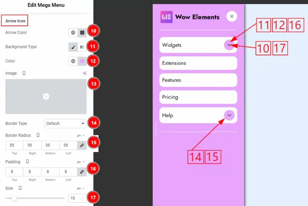
10. Arrow Color: You can change the arrow color with this option.
11. Background Type: You can select the background type between classic & gradient with this option.
12. Color: You can change the arrow icon background color with this option.
13. Image: You can change the background image with this option.
14. Border Type: You can add a border & change its type with this option.
15. Border Radius: You can control the roundness of the border with this option.
16. Padding: You can adjust the inner space of the arrow field with this option.
17. Size: You can adjust the arrow size with this option.
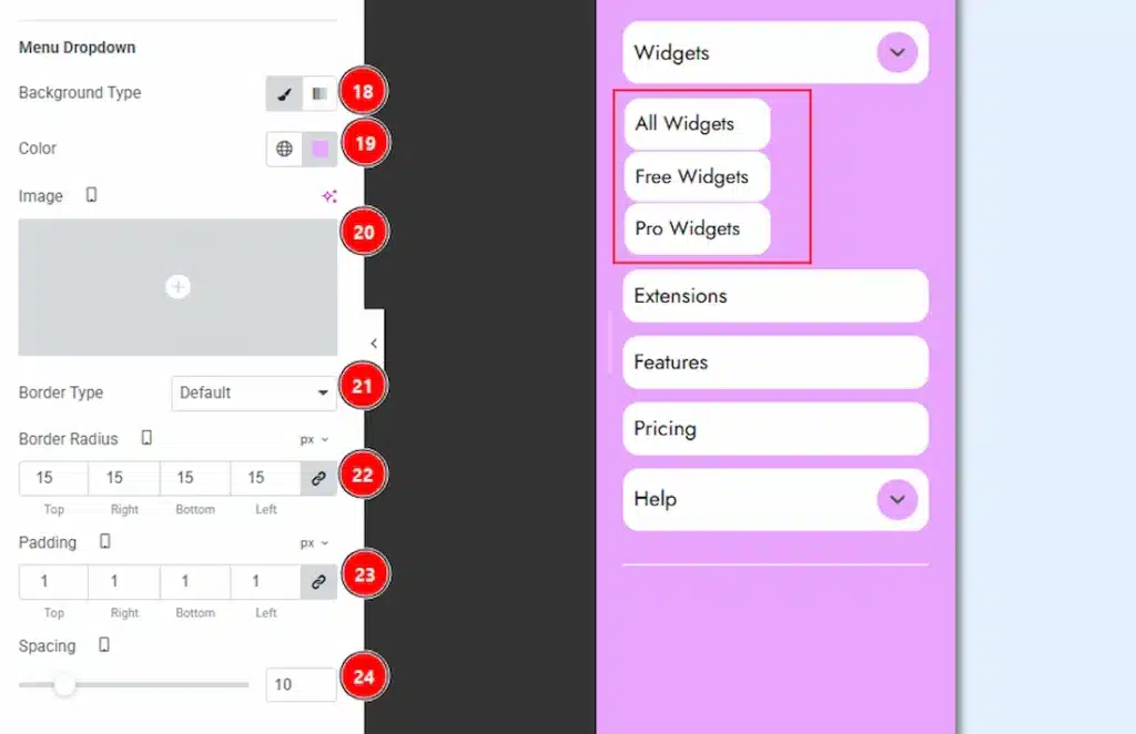
18. Background Type: You can change the background type to classic or gradient with this option.
19. Color: You can change the background color of enu dropdown content with this option.
20. Image: You can change the background image with this option.
21. Border Type: You can add and change the border type with this option.
22. Border Radius: You can control the roundness of the border with this option.
23. Padding: You can adjust the inner space of the menu dropdown content field with this option.
24. Spacing: You can adjust the space between the menu dropdown items with this option.
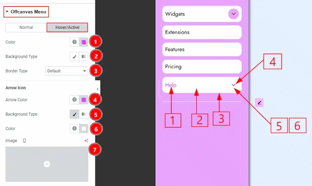
Now let’s proceed to the Hover tab –
1. Color: You can change the off-canvas menu text hover color with this option.
2. Background Type: You can choose the background type between classic & gradient with this option.
3. Border Type: You can change the border & its type with this option.
4. Arrow Color: You can change the arrow icon hover color with this option.
5. Background Type: You can choose the background type to classic or gradient with this option.
6. Color: You can change the arrow’s background hover color with this option.
7. Image: You can change the background hover image with this option.
Badge Section #
Go to Style → Badge
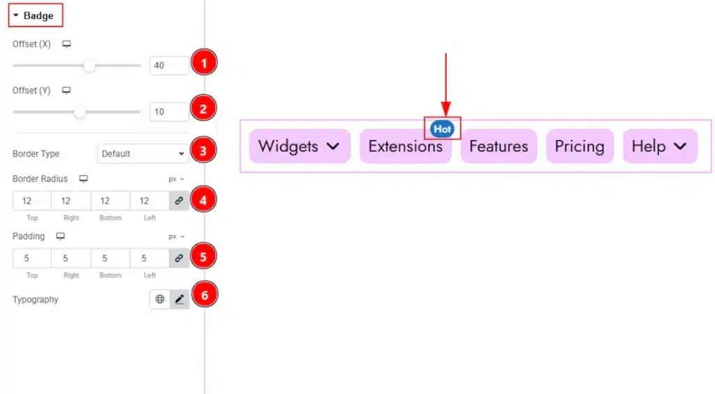
1. Offset (X): You can move the badge horizontally with this option.
2. Offset (Y): You can move the badge vertically with this option.
3. Border Type: You can add & change the border type with this option.
4. Border Radius: You can control the roundness of the border with this option.
5. Padding: You can adjust the inner space of the badge with this option.
6. Typography: Change the font family, size, weight, transform, style, decoration, line height, letter spacing, and word spacing from here.
All done! You have successfully customized the Mega Menu on your website.
Video Assist #
You can also watch the video tutorial to learn more about the Mega Menu. Please visit the demo page for examples.
Thanks for being with us.