



The Product Category Carousel widget from Wow Elements is a powerful tool for showcasing WooCommerce product categories in a smooth and interactive carousel layout on your website. It allows you to display category images, titles, and additional category information in a dynamic slider, making it easier for customers to browse your store and discover products. With flexible carousel, query, and styling options, you can easily customize the category slider to match your store’s branding and enhance the overall shopping experience. In this documentation, we will guide you through how to use and customize the Product Category Carousel widget in Wow Elements Pro.
Enable the Product Category Carousel Widget #
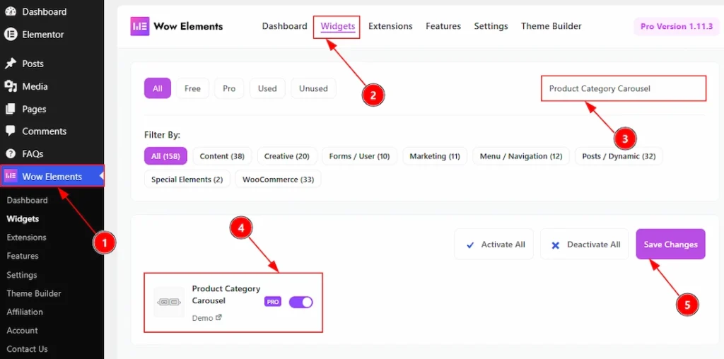
To use the Product Category Carousel by Wow Elements Pro, first, you have to enable the widget.
- Go to WordPress Dashboard → Wow Elements Pro Plugin dashboard.
- Then Click the Widgets Tab.
- Search the Product Category Carousel Widget Name.
- Enable the Product Category Carousel Widget.
- Hit the Save Settings Button.
Inserting the Product Category Carousel widget #
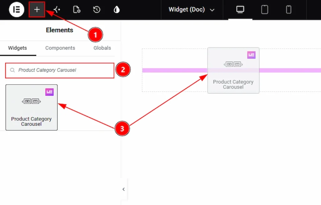
1. Go to the Elementor Editor Page and Hit the “+” icon Button.
2. Search the Product Category Carousel widget.
3. Drag the widget and drop it on the editor page
Content Tab Overview #
Layout Section #
Go to Content → Layout
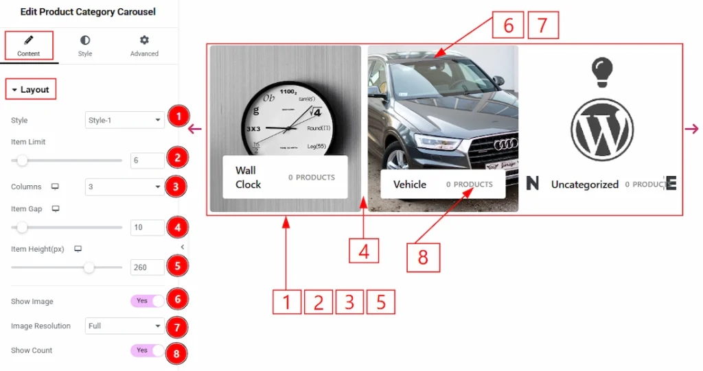
1. Style: You can select the product category layout visual in different 6 styles with this option. Here we have select the style 1 layout.
2. Item Limit: You can adjust the limit to showcase your products category with this option.
3. Columns: You can set how many column you want to show to your audience with this option.,
4. Item Gap: You can ad just the gap between the items with this option.
5. Item Height (px): You can adjust the height of the items with this option.
6. Show Image: Enable the switcher to show the product image to your audience with this option.
7. Image Resolution: You can adjust the resolution of the image with this option.
8. Show Count: Enable the switcher to show the products count in each category with this option.
Query Section #
Go to Content → Query
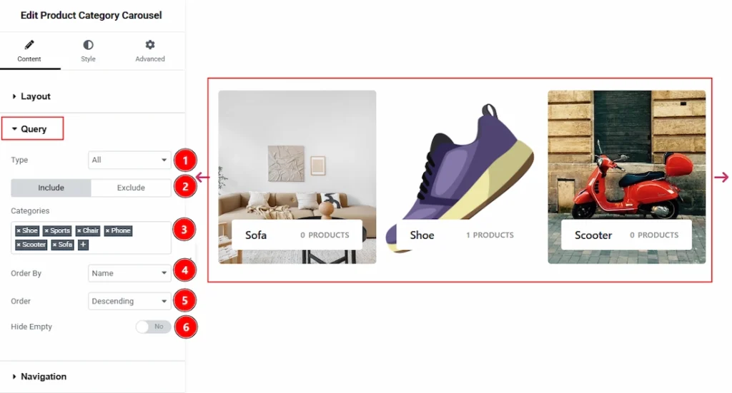
1. Type: You can select the product category type with this option.
2. Include/Exclude: Select the Include / Exclude filter to show/hide specific posts by Terms (Tags/Categories) or Authors. Here, we selected the include field as categories.
3. Categories: You can select the categories here that you want to show to your audience.
4. Order By: It controls the data you want to display through title, id, date, author, comment count, menu order & random. Here we selected the order as date.
5. Order: This option controls the order by which data is arranged. There are two types of order. Ascending Order (Starts from the smallest or lowest value and goes to the largest or highest.) & Descending Order (Starts from the largest or highest value and goes to the smallest or lowest.)
6. Hide Empty: Enable the switcher to hide the product categories that don’t have any product with this option.
Navigation Section #
Go to Content → Navigation
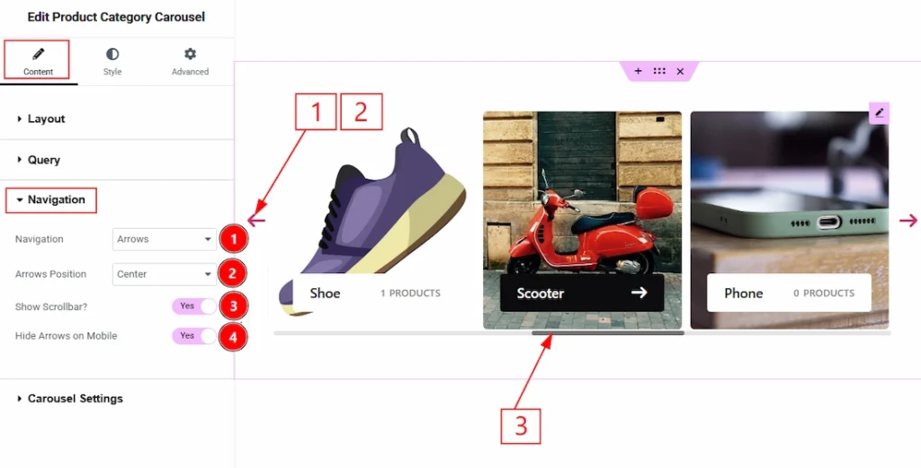
1. Navigation: You can set the navigation type with this option.
2. Arrows Position: You can set the position of the arrows with this option.
3. Show Scrollbar?: Enable the switcher to show the scrollbar to your audience with this option.
4. Hide Arrows on Mobile: Enable the switcher to hide the arrows on mobile with this option.
Carousel Settings Section #
Go to Content → Carousel Settings
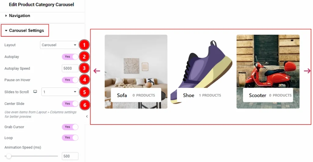
1. Layout: You can select the carousel layout to be carousel or coverflow with this option.
2. Autoplay: Enable the switcher to automatically slides and transitions through the items without requiring the user to click the navigation arrows.
3. Autoplay Speed: You can control the time delay (in milliseconds) before the carousel automatically moves to the next slide. For example, 5000 means it will slide every 5 seconds.
4. Pause on Hover: Enable the switcher to stop automatic sliding completely whenever a user hovers their mouse cursor over the carousel, allowing them to look closer at a product.
5. Slides to Scroll: Sets the specific number of items/cards that slide over at once when the carousel transitions or when a user clicks the navigation arrow.
6. Center Slide: Enable the toggle, it centers the active item in the middle of the display container, which works best when showcasing an odd number of visible columns.
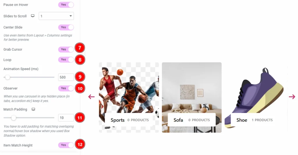
7. Grab Cursor: Enable the switcher to make the mouse pointer changes to a “hand” icon over the carousel with this option.
8. Loop: Enable the switcher to make the carousel slide continuously in an infinite cycle.
9. Animation Speed (ms): You can control how fast the sliding transition effect itself takes to complete (in milliseconds) with this option.
10. Observer: Enable the switcher to ensures the carousel initializes and calculates its layout correctly even if it is placed inside hidden elements like tabs, toggles, or accordion panels.
11. Match Padding: This option allows you to add spacing around the carousel items to prevent overlapping layout issues, clipping, or cut-off edge effects when using customized box shadows on normal or hover states.
12. Item Match Height: Enable the switcher to force all cards or product boxes within the carousel to match the height of the tallest item, ensuring a perfectly uniform and clean carousel alignment.
Style Tab Overview #
Items Section #
Go to Style → Items
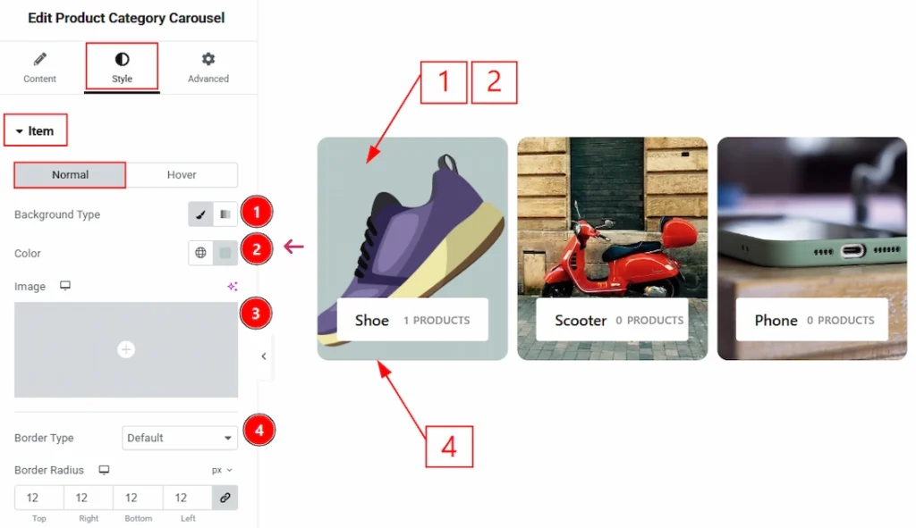
In this section, we have two more tabs. These are Normal & Hover. Let’s start with the Normal Tab first –
1. Background Type: You can change the background type to be classic or gradient with this option. Here, we have selected the background type as Classic.
2. Color: You can make changes to the background color with this option.
3. Image: You can make changes to the background image with this option.
4. Border Type: You can add and change the border types with this option.
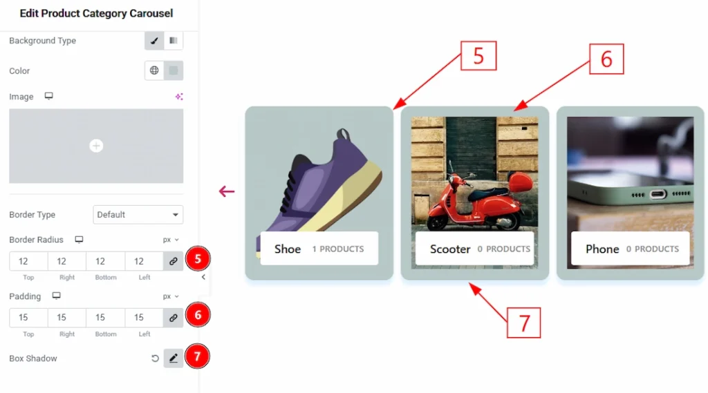
5. Border Radius: You can control the roundness of the border with this option.
6. Padding: You can adjust the inner space of the items with this option.
7. Box Shadow: You can add a shadow effect to the items with this option.
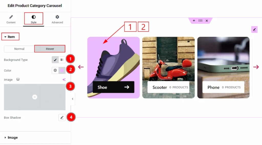
Now, let’s proceed to the Hover Tab –
1. Background Type: You can change the background type to be classic or gradient with this option. Here, we have selected the background type as Classic.
2. Color: You can make changes to the background hover color with this option.
3. Image: You can make changes to the background image with this option.
4. Box Shadow: You can add a hover shadow effect to the item with this option.
Image Section #
Go to Style → Image
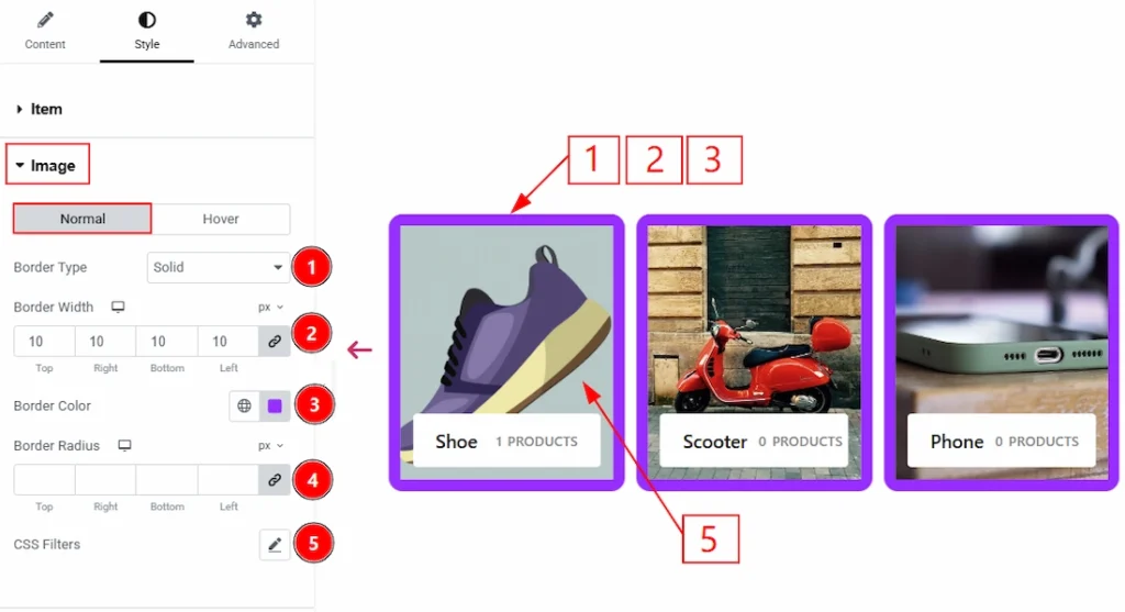
In this section, we have two more tabs. These are Normal & Hover. Let’s start with the Normal Tab first –
1. Border Type: You can add and change the border types with this option.
2. Border Width: You can set the thickness of the border with this option.
3. Border Color: You can make changes to the border color with this option.
4. Border Radius: You can control the roundness of the border with this option.
5. CSS Filters: You can edit and make changes to the image with this option.
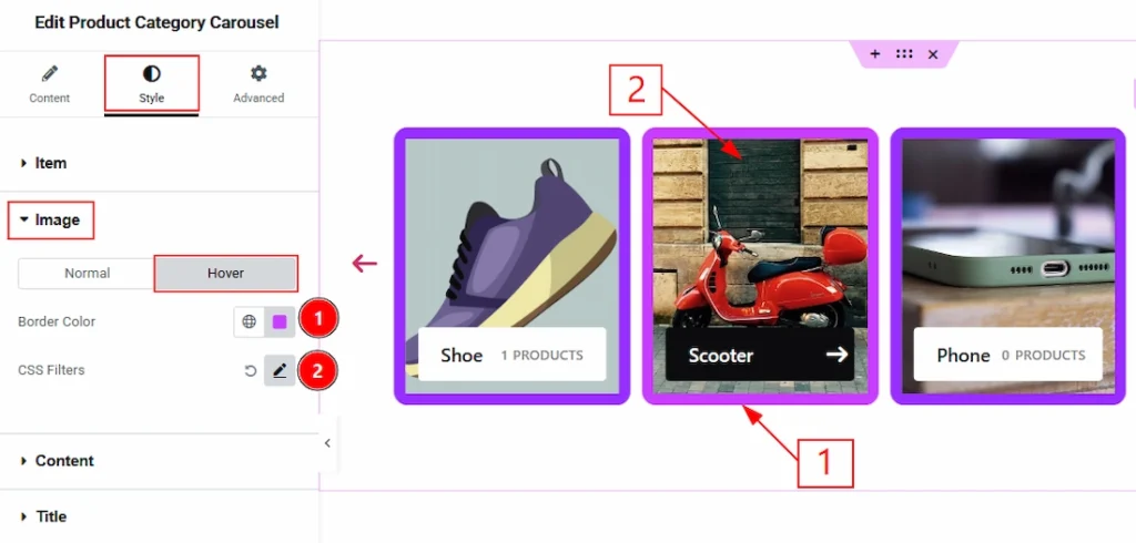
Now, let’s proceed to the Hover tab now –
1. Border Color: You can make changes to the border color with this option.
2. CSS Filters: You can edit and make changes to the image that will show to your audience while hovering on it with this option.
Content Section #
Go to Style → Content
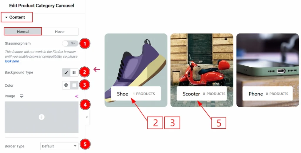
1. Glassmorphism: Enable the switcher to add the blur effect to the content. This will work only if you add the background image.
2. Background Type: You can change the background type to be classic or gradient with this option. Here, we have selected the background type as Classic.
3. Color: You can change the background color with this option.
4. Image: You can change the background image with this option.
5. Border Type: You can add and change the border types with this option.
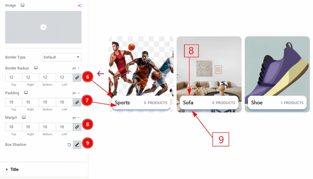
6. Border Radius: You can control the roundness of the border with this option.
7. Padding: You can adjust the inner space of the content field with this option.
8. Margin: You can adjust the space around the field with this option.
9. Box Shadow: You can add a shadow effect to the box shadow with this option.
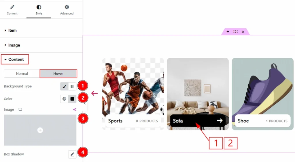
Now, let’s proceed to the Hover Tab –
1. Background Type: You can change the background type to be classic or gradient with this option. Here, we have selected the background type as Classic.
2. Color: You can change the background color with this option.
3. Image: You can add and change the background image with this option.
4. Box Shadow: You can add a hover shadow effect to the content field with this option.
Title Section #
Go to Style → Title
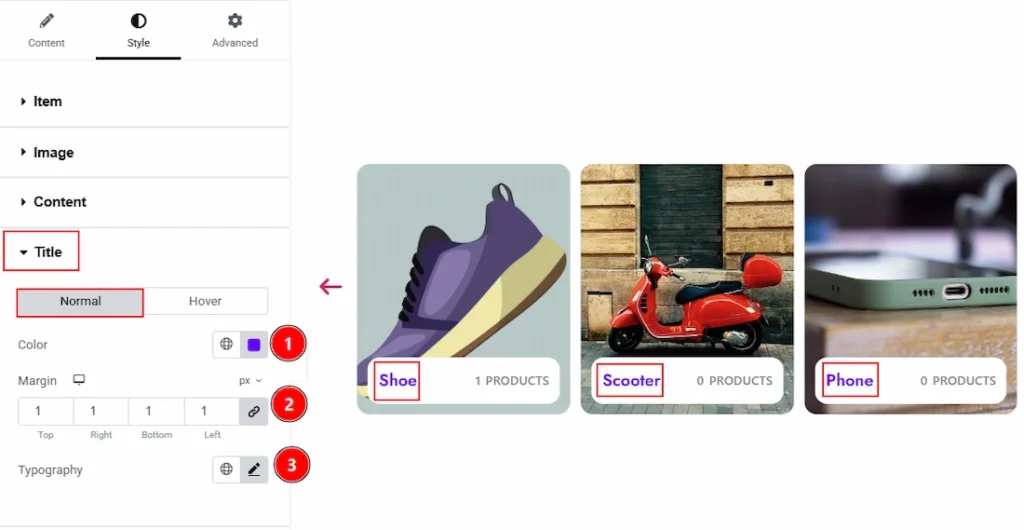
In this section, we have two more tabs. These are Normal & Hover. Let’s start with the Normal Tab first –
1. Color: You can make changes to the title text with this option.
2. Margin: You can adjust the space around the title field with this option.
3. Typography: Change the font family, size, weight, transform, style, decoration, line height, letter spacing, and word spacing from here.
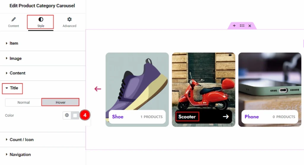
Now, let’s proceed to the Hover tab –
4. Color: You can make changes to the title text hover color with this option.
Count/Icon Section #
Go to Style → Count/Icon
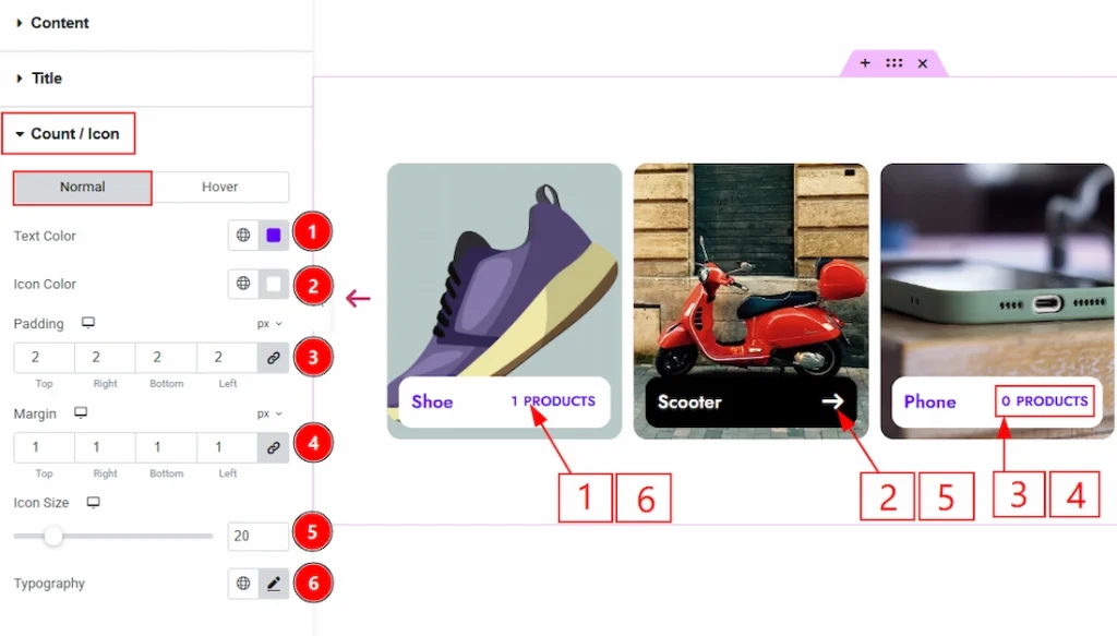
In this section, we have two more tabs. These are Normal & Hover. Let’s start with the Normal Tab first –
1. Text Color: You can make changes to the count text color with this option.
2. Icon Color: You can make changes to the icon color with this option.
3. Padding: You can adjust the inner space with this option.
4. Margin: You can adjust the space around the field with this option.
5. Icon Size: You can adjust the size of the icon with this option.
6. Typography: Change the font family, size, weight, transform, style, decoration, line height, letter spacing, and word spacing from here.
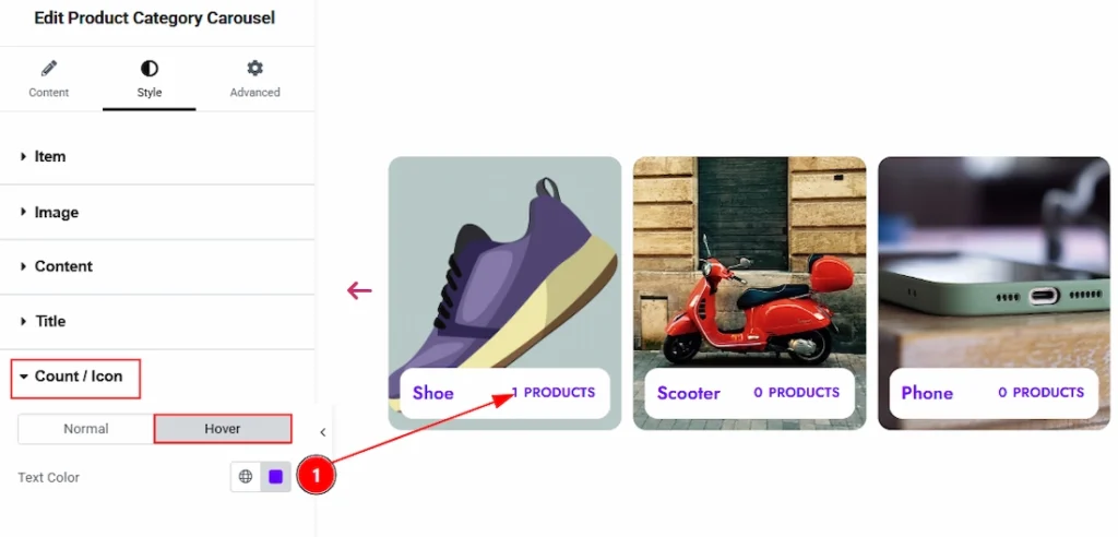
Now, let’s proceed to the Hover Tab –
1. Text Color: You can make changes to the text hover color with this option.
Navigation Section #
Go to Style → Navigation
In this section, we have two more subsections. These are Arrows & Offset. Let’s describe those one by one.
Arrows Sub-section #
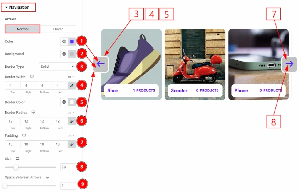
1. Color: You can make changes to the arrows color with this option.
2. Background: You can make changes to the arrows background color with this option.
3. Border Type: You can add and change the border types with this option.
4. Border Width: You can set the thickness of the border with this option.
5. Color: You can change the border color with this option.
6. Border Radius: You can control the roundness of the border with this option.
7. Padding: You can adjust the inner space of the arrow field with this option.
8. Size: You can make changes to the arrows size with this option.
9. Space Between Arrows: You can adjust the space between the arrows with this option.
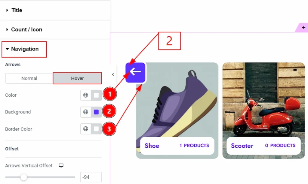
Now, let’s move to the Hover Tab –
1. Color: You can make changes to the arrows hover color with this option.
2. Background: You can make changes to the hover background color with this option.
3. Border Color: You can make changes to the border hover color with this option
Offset Sub-section #
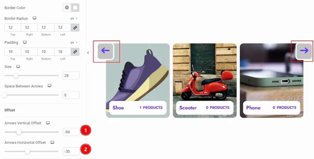
1. Arrows Vertical Offset: You can move the arrows position vertically with this option.
2. Arrows Horizontal Offset: You can move the arrows position horizontally with this option.
All done! You have successfully customized the Product Category Carousel widget on your website.
Video Assist #
You can also watch the video tutorial to learn more about the Product Category Carousel Widget. Please visit the demo page for examples.
Thanks for being with us.