



The Cursor Effects extension in Wow Elements allows you to add interactive and visually engaging cursor animations to your website elements. It helps enhance user interaction by applying custom cursor styles, hover effects, and motion animations without any coding. With flexible customization options, you can create modern and dynamic browsing experiences that make your website more engaging and visually appealing. In this documentation, we will guide you through how to use and customize the Cursor Effects extension in Wow Elements.
Enable the Cursor Effects Extension #
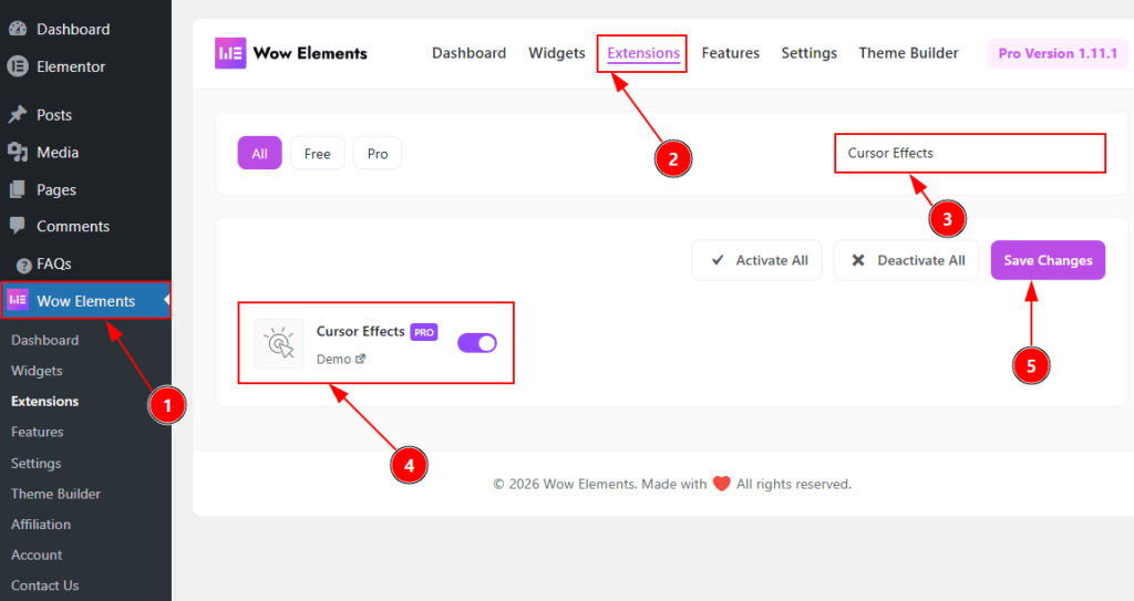
To use the Cursor Effects Extension from Wow Elements Pro, first, you have to enable the extension.
- Go to WordPress dashboard → Wow Elements Plugin dashboard.
- Then, Click the Extension Tab.
- Search the Cursor Effects Extension Name.
- Enable the Cursor Effects Extension.
- Hit the Save Settings Button.
Where To Find The Cursor Effects Extension #
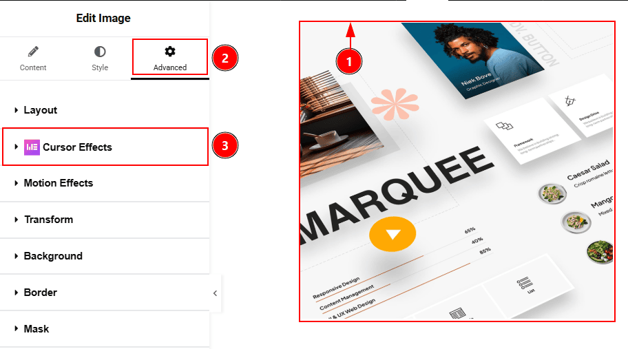
To find the Cursor Effects Extension, you must need to select the any elemenets/container where you want to use the extension. Let’s see the steps below –
1. Click to any elements to select it. Here we have select an image widget.
2. Now move to the Advanced tab to customizing the image.
3. Here you will found the Cursor Effects extension visible.
Configuring the Cursor Effects Extension #
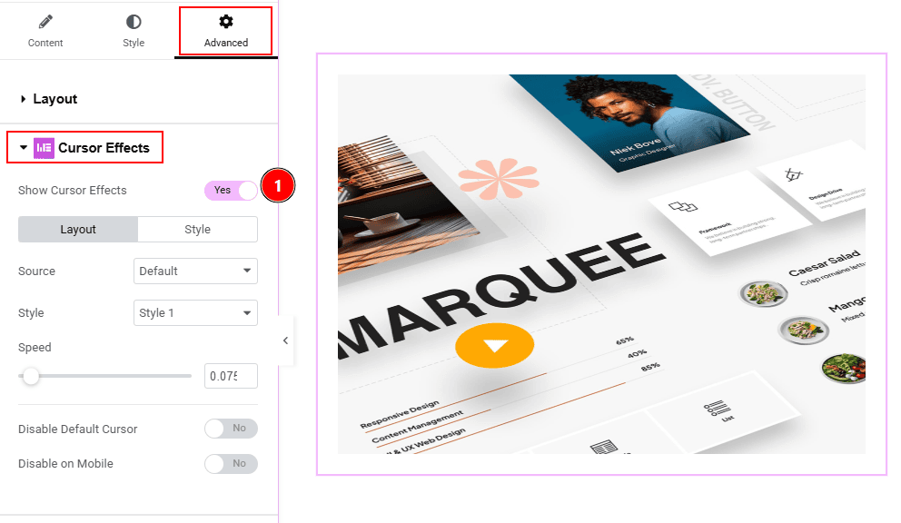
1. Enable the switcher to get the customization options for the cursor effects. There are various kinds of source that you can use to show the cursor effects to your audience. Let’s explore those one by one –
Default Source #
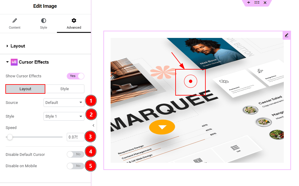
In this section, we have two more tabs. These are Layout and Style. Let’s start with the Layout Tab first –
1. Source: You can select the source of the cursor with this option. The available options are default, text, image & icon. Here we have selected the source as default.
2. Style: In default source, you will get three styles of the cursor. Choose one that you prefer.
3. Speed: You can adjust the cursor moving speed with this option.
4. Disable Default Carousel: Enable the switcher to turn off the default cursor appearance on the selected elements.
5. Disable on Mobile: Enable the switcher to turn of the cursor effect on mobile device.
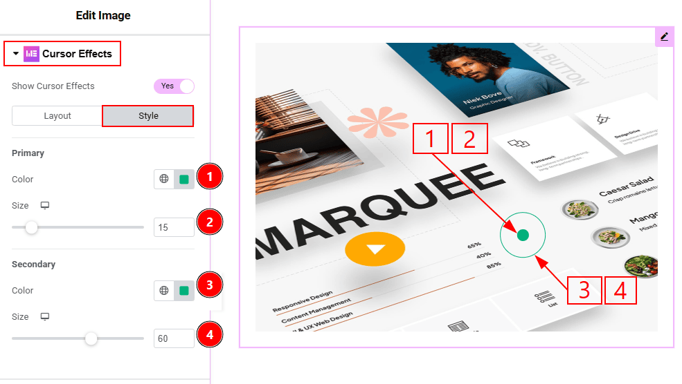
Now, let’s proceed to the Style Tab –
1. Primary Color: You can make changes to the primary cursor color with this option.
2. Size: You can adjust the size of the primary cursor with this option.
3. Secondary Color: You can make changes to the secondary cursor color with this option.
4. Size: You can adjust the size of the secondary cursor with this option.
Text Source #
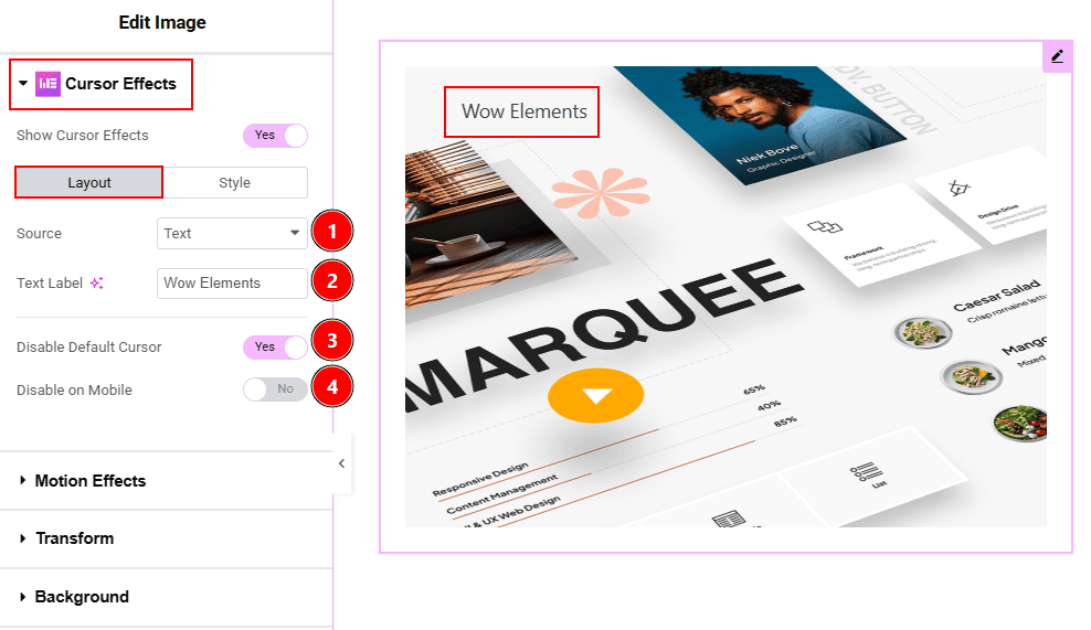
In this section, we have two more tabs. These are Layout & Style. Let’s explore the Layout Tab first –
1. Source: You can select the cursor source with this option. Here we have selected the source as Text.
2. Text Label: You can add title text and make changes to it with this option.
3 Disable Default Carousel: Enable the switcher to turn off the default cursor appearance on the selected elements.
4. Disable on Mobile: Enable the switcher to turn of the cursor effect on mobile device.
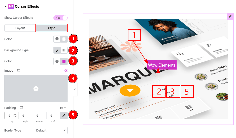
Now, let’s proceed to the Style tab –
1. Color: You can make changes to the text color with this option.
2. Background Type: You can select the background type to be classic or gradient with this option.
3. Color: You can change the background color with this option.
4. Image: You can change the background image with this option.
5. Padding: You can adjust the inner space of the text field with this option.
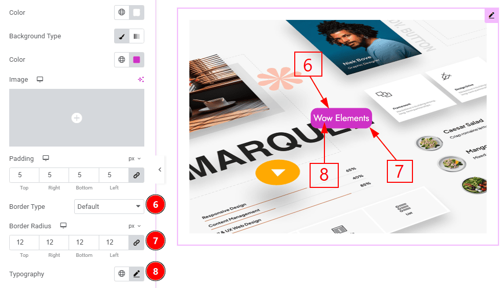
6. Border Type: You can add and change the border types with this option.
7. Border Radius: This option controls the roundness of the border.
8. Typography: Change the font family, size, weight, transform, style, decoration, line height, letter spacing, and word spacing from here.
Image Source #
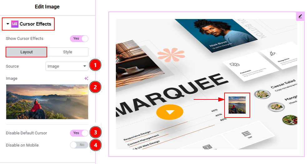
In this section, we have two more tabs. These are Layout and Style. Let’s start with the Layout tab first –
1. Source: You can select the cursor source as image in this field.
2. Image: You can add the image that you want to use as a cursor in this field.
3 Disable Default Carousel: Enable the switcher to turn off the default cursor appearance on the selected elements.
4. Disable on Mobile: Enable the switcher to turn of the cursor effect on mobile device.
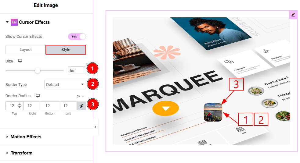
Now, let’s proceed to the Style tab –
1. Size: You can make changes to the image cursor size with this option.
2. Border Type: You can add and change the border types with this option.
3. Border radius: You can control the roundness of the border with this option.
Icon Source #
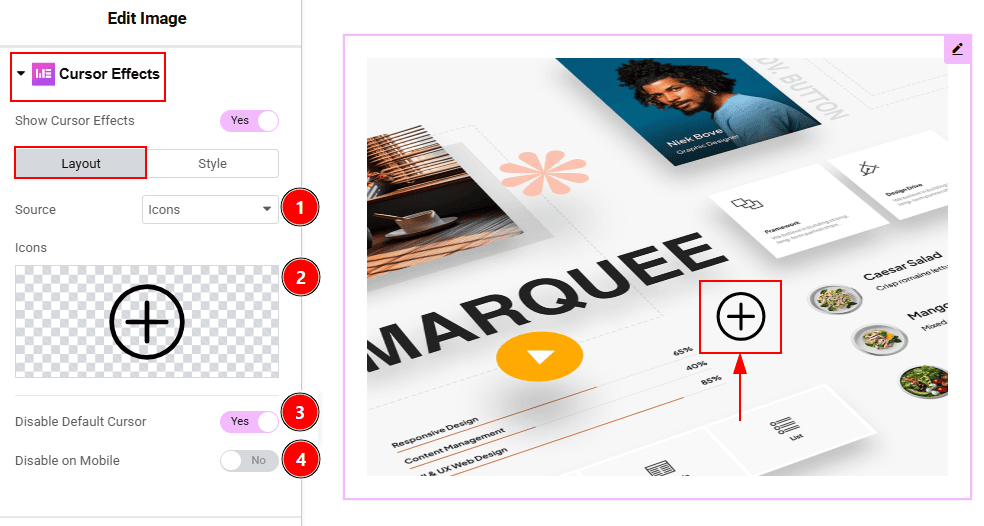
In this section, we have two more tabs. These are Layout and Style. Let’s start with the Layout tab first –
1. Source: You can select the cursor source as icon in this field.
2. Icons: You can add the icons that you want to use as a cursor in this field.
3 Disable Default Carousel: Enable the switcher to turn off the default cursor appearance on the selected elements.
4. Disable on Mobile: Enable the switcher to turn of the cursor effect on mobile device.
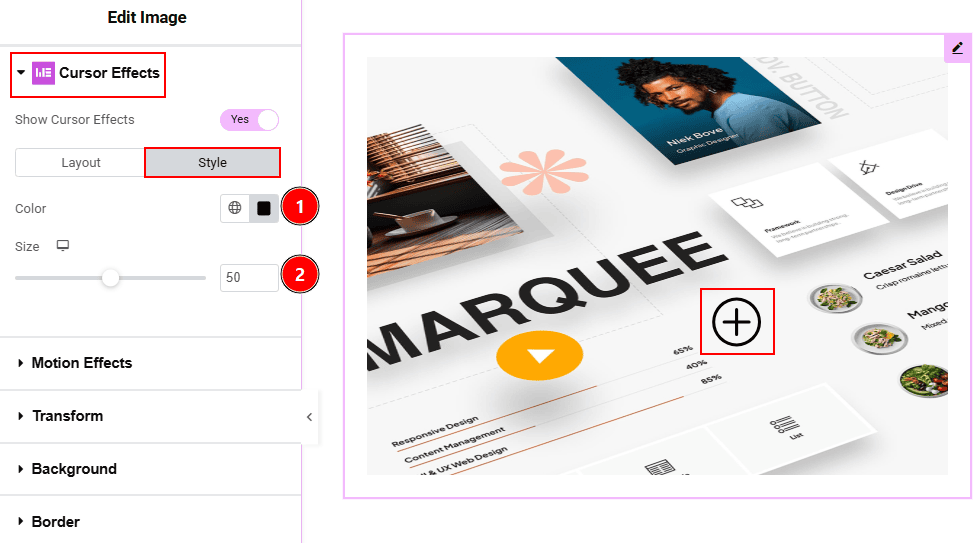
Now, let’s proceed to the style tab –
1. Color: You can change the icon cursor color with this option.
2. Size: You can make changes the size of the icon cursor with this option.
All done, You have successfully customized the Cursor Effects Extension on your website.
Video Assist #
You can also watch the tutorial video about the Cursor Effects Extension. Please visit the demo page for examples.
Thanks for staying with us.