



The Product Accordion widget from Wow Elements Pro is a powerful tool for displaying WooCommerce products in a compact and interactive accordion layout on your website. It allows you to organize product information in expandable sections, helping customers browse products and details without taking up too much page space. With flexible layout, content, and styling options, you can easily customize the accordion to match your store’s branding and enhance the overall shopping experience. In this documentation, we will guide you through how to use and customize the Product Accordion widget in Wow Elements Pro.
Enable the Product Accordion Widget #
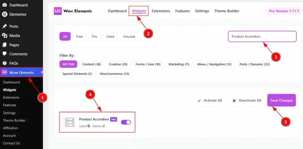
To use the Product Accordion by Wow Elements Pro, first, you have to enable the widget.
- Go to WordPress Dashboard → Wow Elements Pro Plugin dashboard.
- Then Click the Widgets Tab.
- Search the Product Accordion Widget Name.
- Enable the Product Accordion Widget.
- Hit the Save Settings Button.
Inserting the Product Accordion widget #
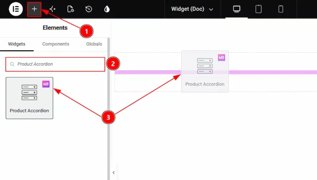
1. Go to the Elementor Editor Page and Hit the “+” icon Button.
2. Search the Product Accordion widget.
3. Drag the widget and drop it on the editor page
Content Tab Overview #
Layout Section #
Go to Content → Layout
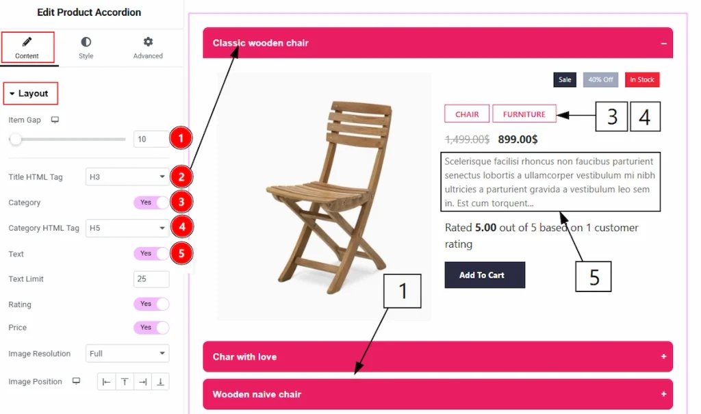
1. Item Gap: You can adjust the gap between the items with this option.
2. Title HTML Tag: You can adjust the HTML tag for the title with this option.
3. Category: Enable the switcher to show the category of the items with this option.
4. Category HTML Tag: You can set the HTML tag for the category text with this option.
5. Text: Enable the switcher to show the text to your audience with this option.
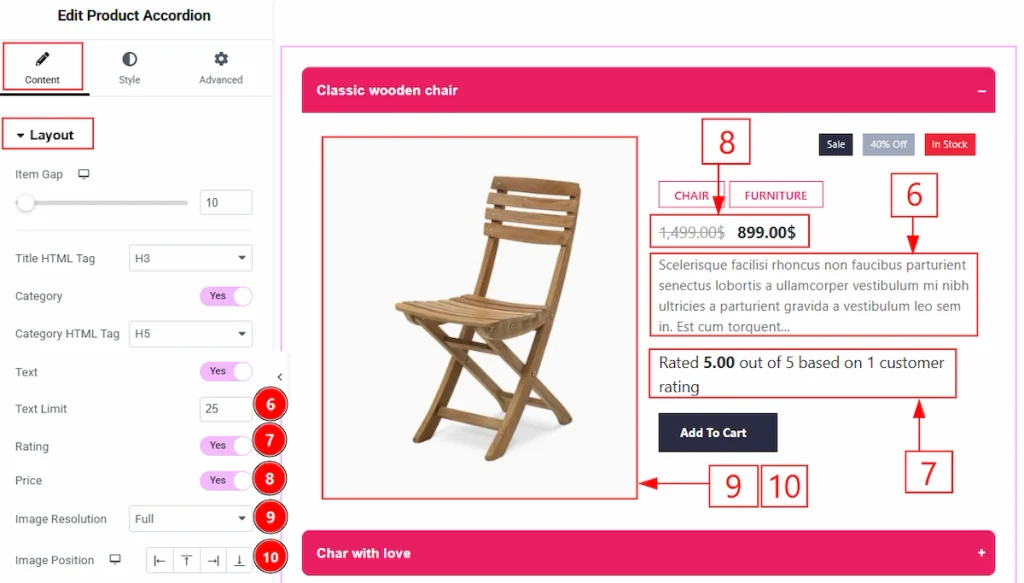
6. Text Limit: You can set the limit for the product description text with this option.
7. Rating: Enable the switcher to show the ratings of the products to your audience with this option.
8. Price: Enable the switcher to show the price of the product to your audience with this option.
9. Image Resolution: You can set the resolution for the product image with this option.
10. Image Position: You can set the position of the image to be placed in left, bottom, right or top with this option.
Query Section #
Go to Content → Query
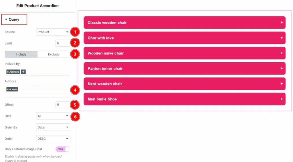
1. Source: Select the source for the Product Grid. You can select the source type- Product, Manual Selection, Current Query & Related option.
2. Limit: You can set the Product Limit from Here.
3. Include/Exclude Selection: Select Include / Exclude filter to show/hide specific posts by Terms (Tags/Categories) or Authors.
4. Terms: This option lets you select the Product Category/Tags from here.
5. Offset: The Offset option lets you skip a certain number of posts from the start, so the display begins from the next post instead. Keeping it 0 means post without any exclusion.
6. Date: You can select the post as per the date of creation with this option.
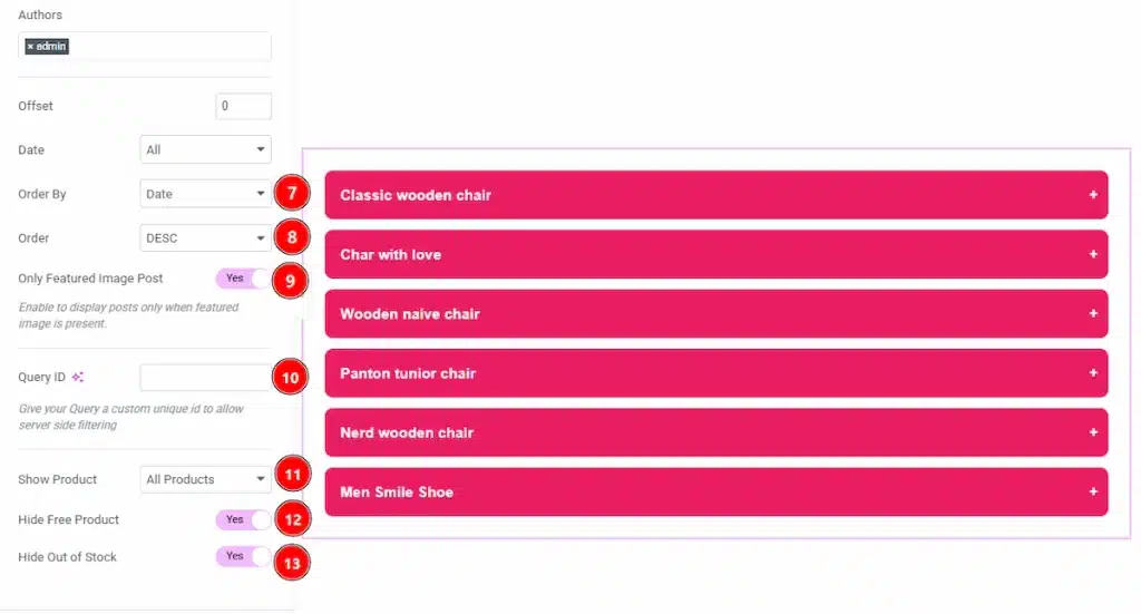
7. Order By: It controls the data you want to display through title, id, date, author, comment count, menu order & random. Here we selected the order as date.
8. Order: This option controls the order by which data is arranged. There are two types of order. Ascending Order (Starts from the smallest or lowest value and goes to the largest or highest.) & Descending Order (Starts from the largest or highest value and goes to the smallest or lowest.)
9. Only Featured Image Post: Enable or disable the switcher to show or hide the featured image post.
10. Query ID: Give your query a custom, unique ID to allow server-side filtering.
11. Show Product: You can select which products you want to show to your audience with this option.
12. Hide Free Product: Enable the switcher to hide the free product with this option.
13. Hide Out of Stock: Enable the switcher to hide the product that are out of stock with this option.
Additional Options Section #
Go to Content → Additional Options
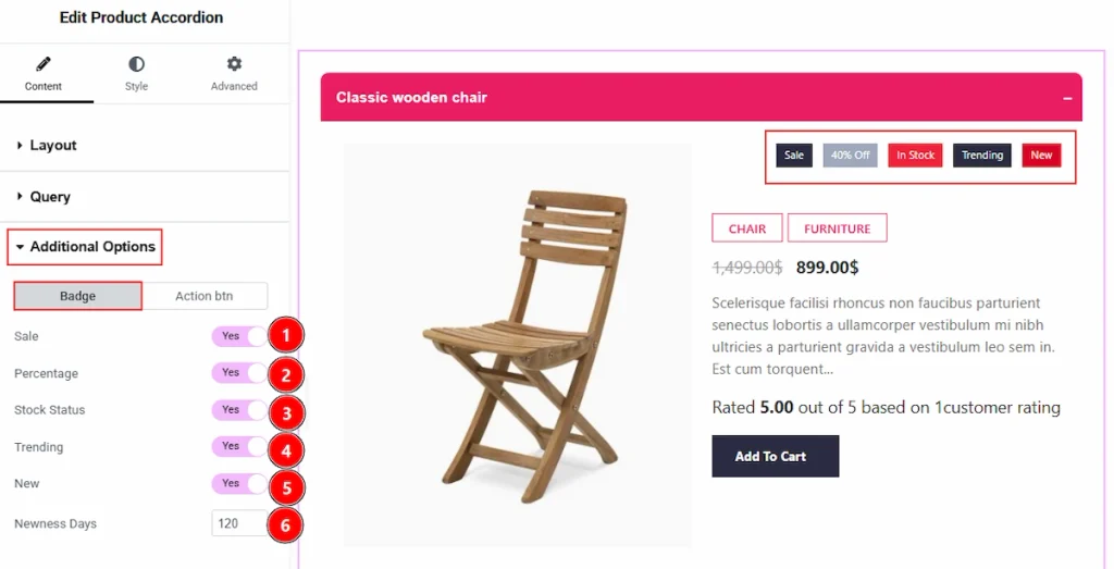
In this section, we have two more tabs. These are Badge & Action Button. Let’s start with the Badges tab first –
1. Sale: Enable the switcher to show the sale badge to your audience with this option.
2. Percentage: Enable the switcher to show the percentage badge to your audience with this option.
3. Stock Status: Enable the switcher to show the stock status to your audience with this option.
4. Trending: Enable the switcher to show the trending badge to your audience with this option.
5. New: Enable the switcher to show the new badge on the product with this option.
6. Newness Days: You can set the newness days for the product with this option.
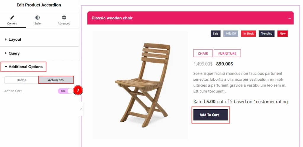
Now, let’s proceed to the Action Button tab –
1. Add to Cart: Enable the switcher to show the add to cart button on the product with this option.
Style Tab Overview #
Items Section #
Go to Style → Items
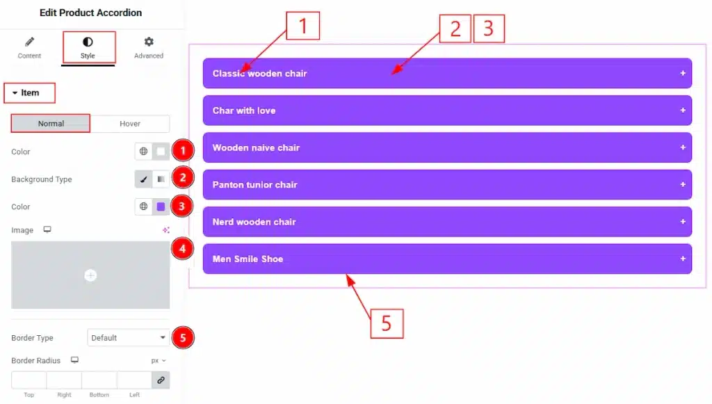
In this section, we have two more tabs. These are Normal & Hover. Let’s start describing those one by one –
1. Color: You can make changes to the item title text color with this option.
2. Background Type: You can change the background type to be classic or gradient with this option. Here, we have selected the background type as Classic.
3. Color: You can change the background color with this option.
4. Image: You can change the background image with this option.
5. Border Type: You can add and change the border types with this option.
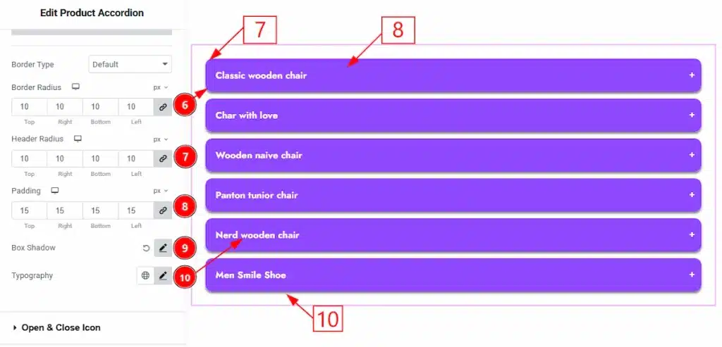
6. Border Radius: You can control the roundness of the border with this option.
7. Header Radius: You can make changes to the header roundness with this option.
8. Padding: You can adjust the inner space of the item field with this option.
9. Box Shadow: You can add a shadow effect to the items field with this option.
10. Typography: Change the font family, size, weight, transform, style, decoration, line height, letter spacing, and word spacing from here.
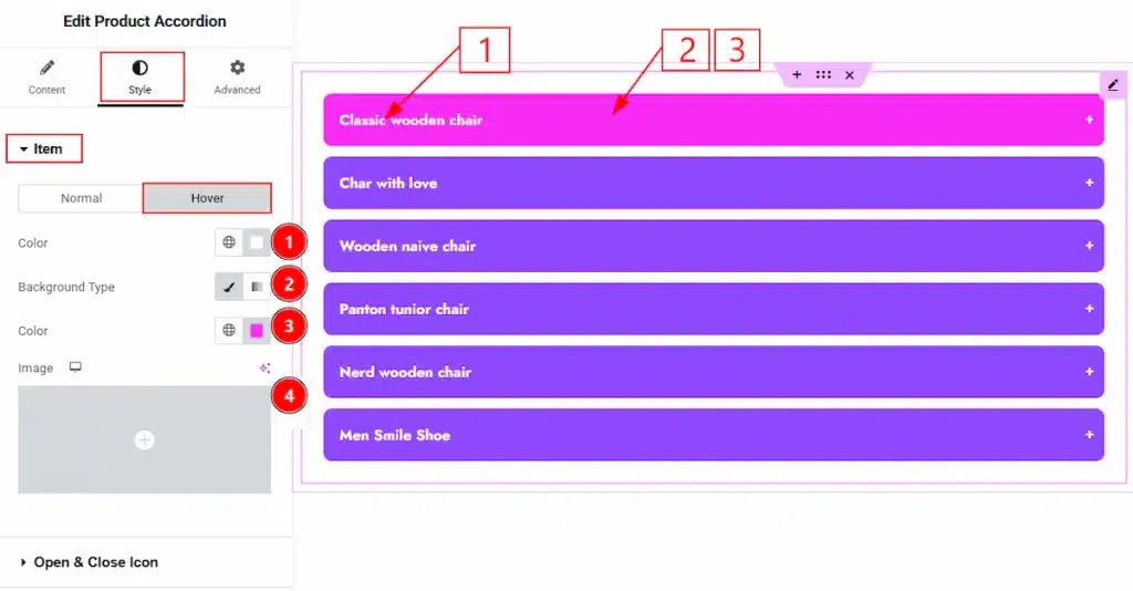
Now, let’s proceed to the Hover tab –
1. Color: You can make changes to the item text hover color with this option.
2. Background Type: You can change the background type to be classic or gradient with this option. Here, we have selected the background type as Classic.
3. Color: You can change the background hover color with this option.
4. Image: You can change the background image with this option.
Open & Close Icon Section #
Go to Style → Open & Close Icon
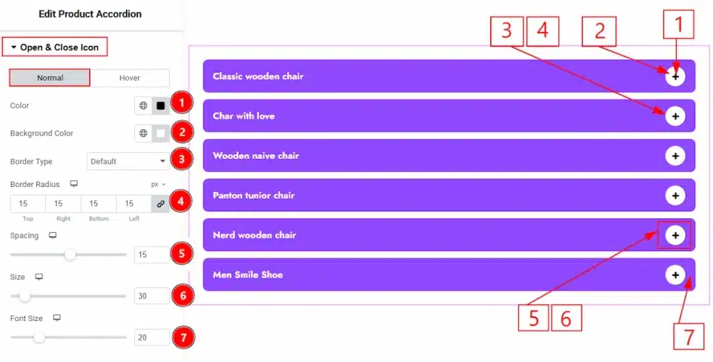
In this section, we have two more tabs. These are Normal & Hover. Let’s start with the Normal Tab first –
1. Color: You can make changes to the open and close icon color with this option.
2. Background Color: You can make changes to the background color with this option.
3. Border Type: You can add and change the border types with this option.
4. Border Radius: You can control the roundness of the border with this option.
5. Spacing: You can adjust the space between the items and icons with this option.
6. Size: You can make changes to the background of icon size with this option.
7. Font Size: You can make changes to the icon size with this option.
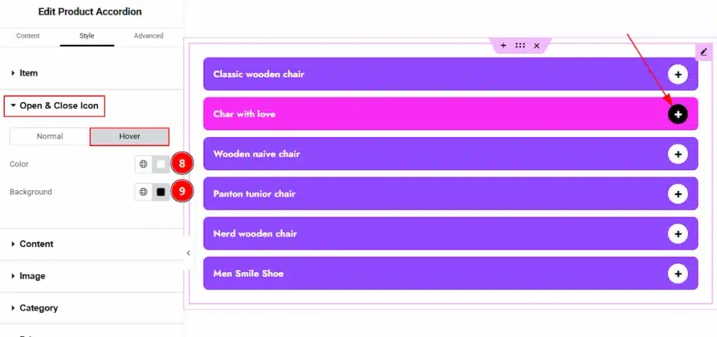
Now, let’s proceed to the Hover Tab –
8. Color: You can make changes to the icon hover color with this option.
9. Background: You can make changes to the icon’s background hover color with this option.
Content Section #
Go to Style → Content
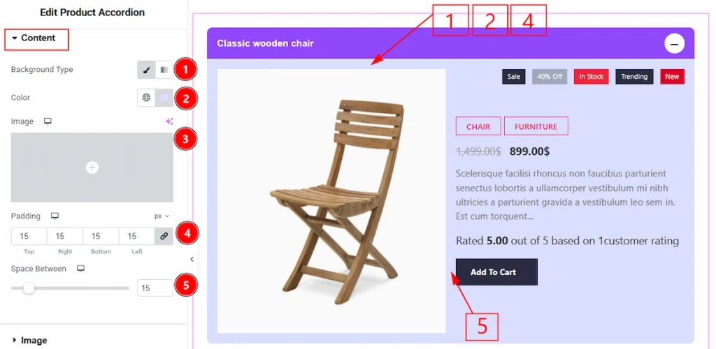
1. Background Type: You can change the background type to be classic or gradient with this option. Here, we have selected the background type as Classic.
2. Color: You can make changes to the content field background color with this option.
3. Image: You can change the image with this option.
4. Padding: You can adjust the inner space of the content field with this option.
5. Spacing Between: You can adjust the space between the elements of content field with this option.
Image Section #
Go to Style → Image
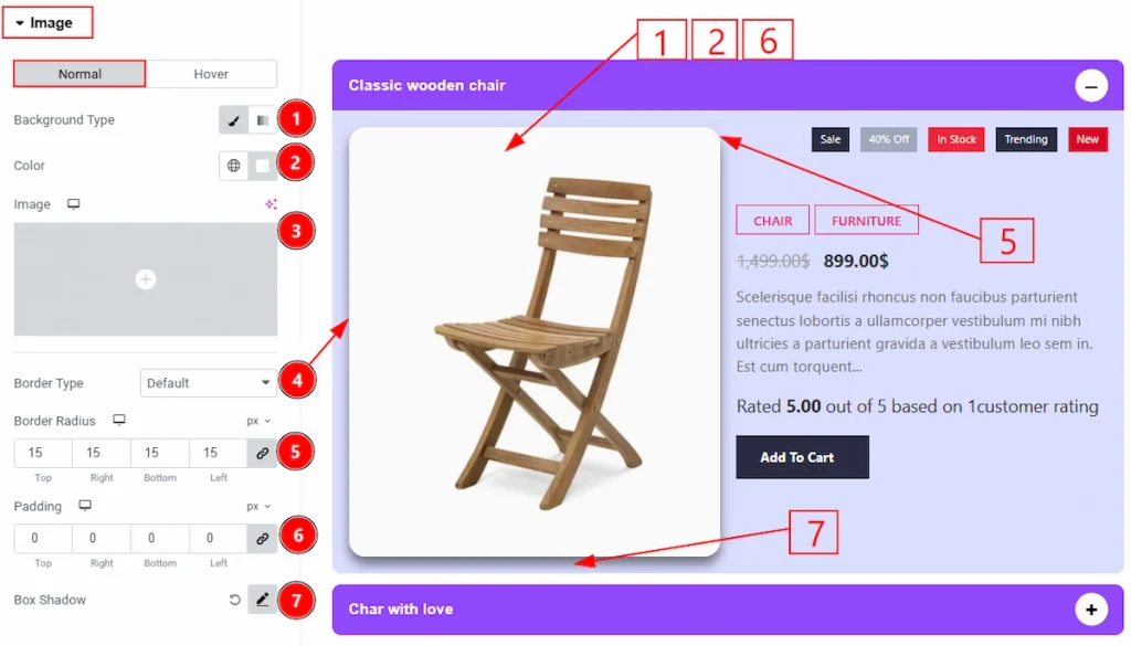
In this section, we have two more tabs. These are Normal & Hover. Let’s start with the Normal tab first –
1. Background Type: You can change the background type to be classic or gradient with this option. Here, we have selected the background type as Classic.
2. Color: You can make changes the background color of the image with this option. (Note: The background color will change if the image is in png format)
3. Image: You can change the background image with this option.
4. Border Type: You can add and change the border types with this option.
5. Border Radius: You can control the roundness of the border with this option.
6. Padding: You can adjust the inner space of the image field with this option.
7. Box Shadow: You can add a shadow effect to the image with this option.
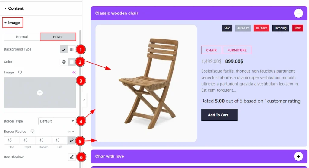
Now, let’s proceed to the Image Hover Tab –
1. Background Type: You can change the background type to be classic or gradient with this option. Here, we have selected the background type as Classic.
2. Color: You can make changes to the image hover background color with this option.
3. Image: You can change the background image with this option.
4. Border Type: You can add and change the border types with this option.
5. Border Radius: You can control the roundness of the border with this option.
6. Box Shadow: You can add a hover shadow effect with this option.
Category Section #
Go to Content → Category
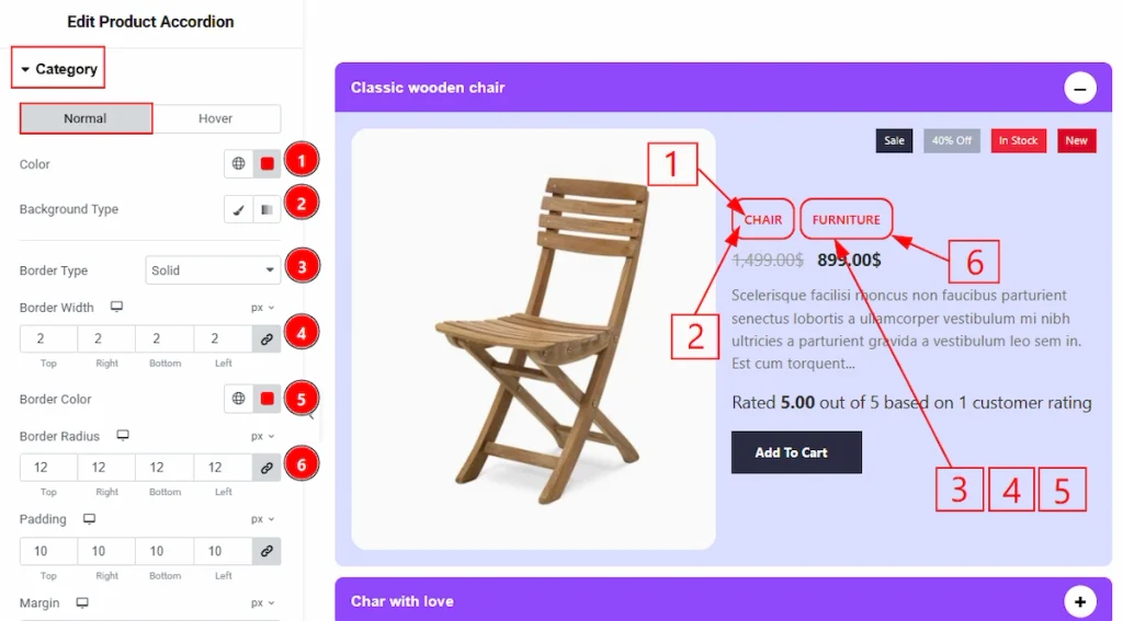
In this section, we have two more tabs. These are Normal & Hover. Let’s start describing the Normal tab first –
1. Color: You can make changes to the category text color with this option.
2. Background Type: You can change the background type to be classic or gradient with this option. Here, we have selected the background type as Classic.
3. Border Type: You can add and change the border types with this option.
4. Border Width: You can set the thickness of the border with this option.
5. Border Color: You can make changes to the border color with this option.
6. Border Radius: You can control the roundness of the border with this option.
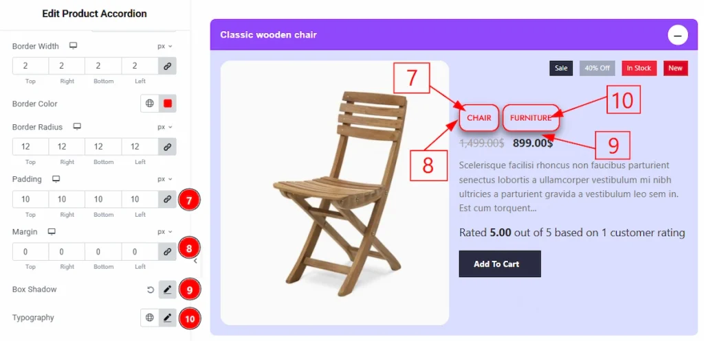
7. Padding: You can adjust the inner space with this option.
8. Margin: You can adjust the space around the field with this option.
9. Box Shadow: You can add a shadow effect to the category field with this option.
10. Typography: Change the font family, size, weight, transform, style, decoration, line height, letter spacing, and word spacing from here.
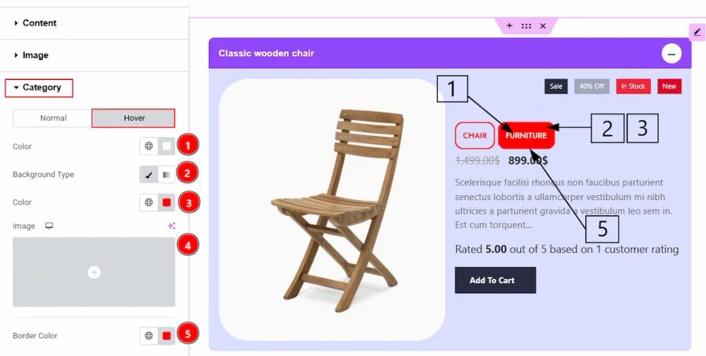
Now, let’s proceed to the Hover tab –
1. Color: You can change the category text hover color with this option.
2. Background Type: You can change the background type to be classic or gradient with this option. Here, we have selected the background type as Classic.
3. Color: You can change the background hover color with this option.
4. Image: You can change the background hover image with this option.
5. Border Color: You can make changes to the border hover color with this option.
Price Section #
Go to Style → Price
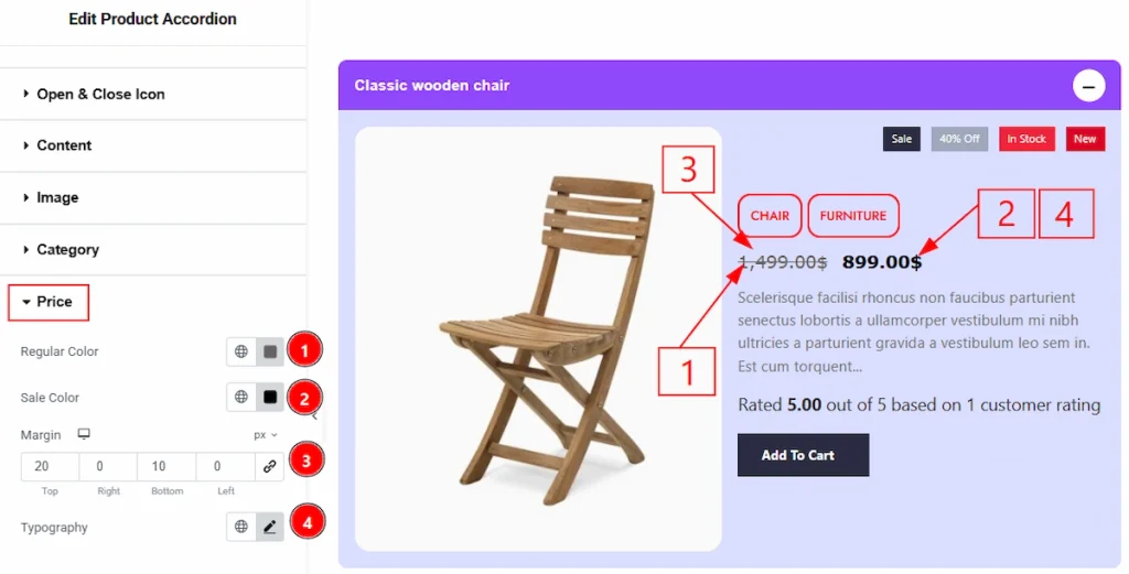
1. Regular Color: You can make changes to the regular price color with this option.
2. Sale Color: You can change the sale price color with this option.
3. Margin: You can adjust the space around the field with this option.
4. Typography: Change the font family, size, weight, transform, style, decoration, line height, letter spacing, and word spacing from here.
Text Section #
Go to Content → Text
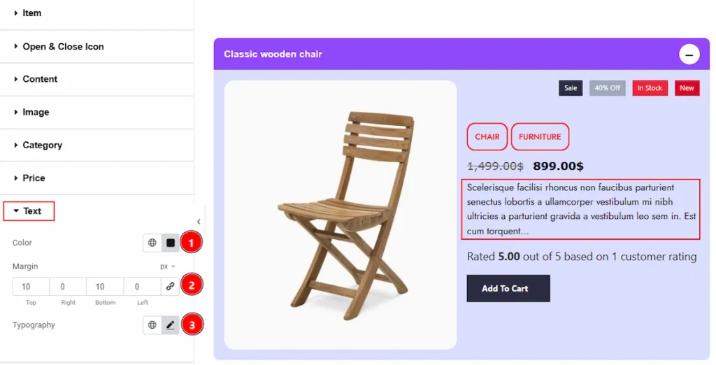
1. Color: You can make changes to the text color with this option.
2. Margin: You can adjust the space around the text field with this option.
3. Typography: Change the font family, size, weight, transform, style, decoration, line height, letter spacing, and word spacing from here.
Rating Section #
Go to Content → Rating
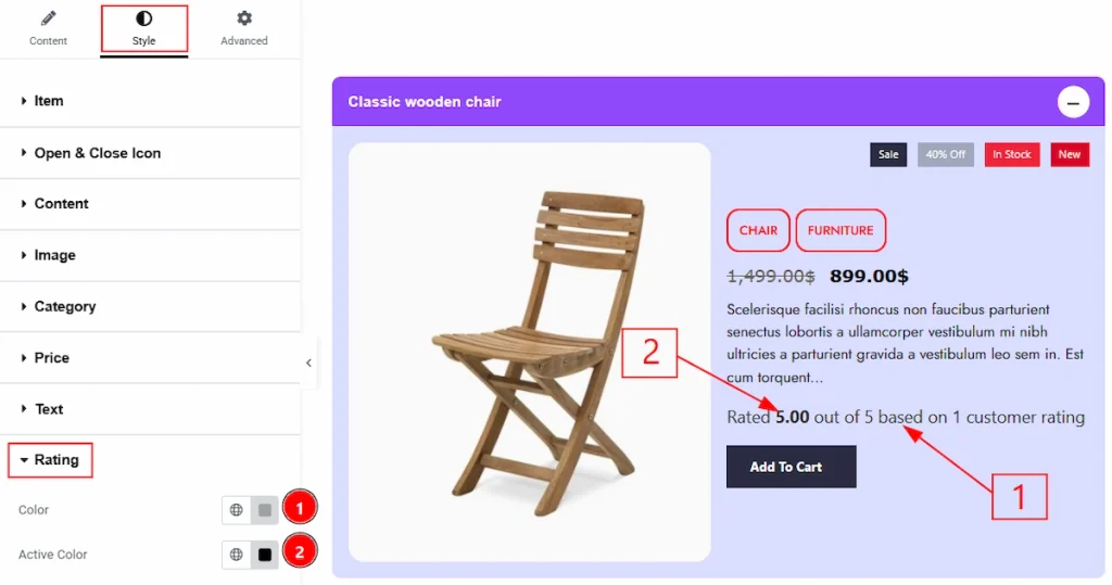
1. Color: You can change the rating color with this option.
2. Active Color: You can change the active rating color with this option.
Badge Section #
Go to Content → Badge
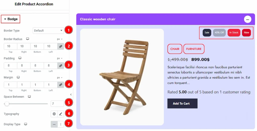
1. Border Type: You can add and change the border types with this option.
2. Border Radius: You can control the roundness of the border with this option.
3. Padding: You can adjust the inner space of the badges with this option.
4. Margin: You can adjust the space around the field with this option.
5. Space Between: You can adjust the space between the badges with this option.
6. Typography: Change the font family, size, weight, transform, style, decoration, line height, letter spacing, and word spacing from here.
7. Display Type: You can show the badges in list on inline type with this option.
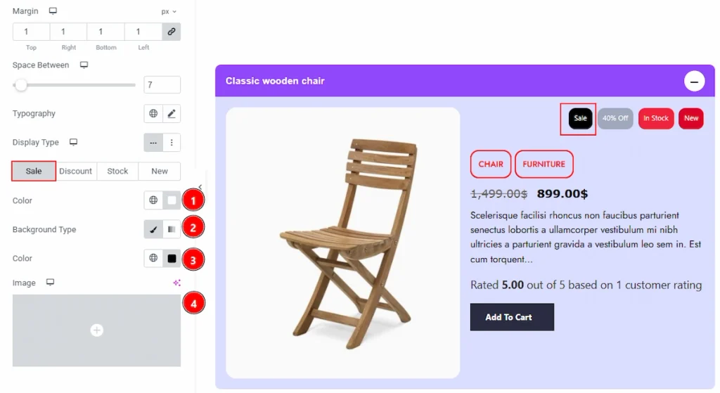
In this section, we have four more tabs. These are Sale, Discount, Stock & New. Let’s start describing those one by one –
1. Color: You can make changes to the sale badge text color with this option.
2. Background Type: You can change the background type to be classic or gradient with this option. Here, we have selected the background type as Classic.
3. Color: You can change the badge background color with this option.
4. Image: You can change the background image with this option.
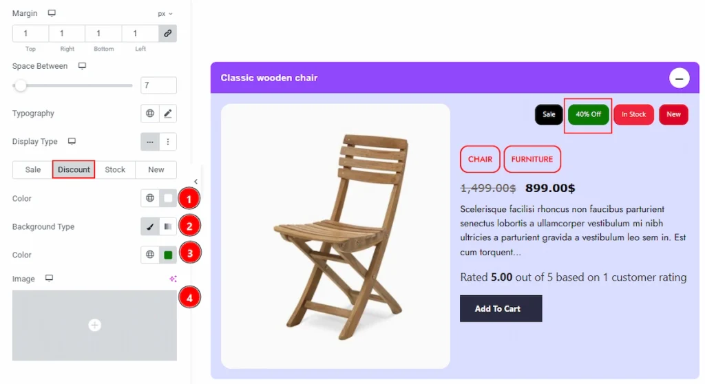
Now, let’s proceed to the Discount tab –
1. Color: You can make changes to the discount badge text color with this option.
2. Background Type: You can change the background type to be classic or gradient with this option. Here, we have selected the background type as Classic.
3. Color: You can change the badge background color with this option.
4. Image: You can change the background image with this option.
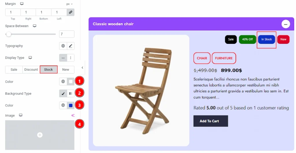
Now, let’s proceed to the Stock tab –
1. Color: You can make changes to the stock badge text color with this option.
2. Background Type: You can change the background type to be classic or gradient with this option. Here, we have selected the background type as Classic.
3. Color: You can change the badge background color with this option.
4. Image: You can change the background image with this option.
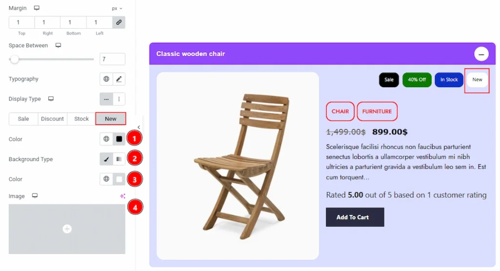
Now, let’s proceed to the New tab –
1. Color: You can make changes to the new badge text color with this option.
2. Background Type: You can change the background type to be classic or gradient with this option. Here, we have selected the background type as Classic.
3. Color: You can change the badge background color with this option.
4. Image: You can change the background image with this option.
Add to Cart Section #
Go to Style → Add to Cart
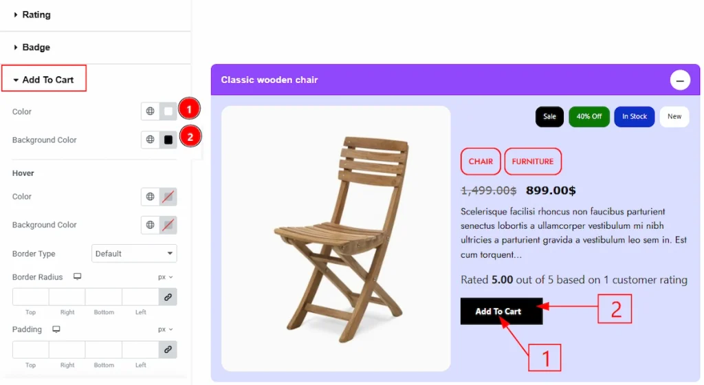
1. Color: You can make changes to the add to cart text color with this option.
2. Background Color: You can make changes to the button’s background color with this option
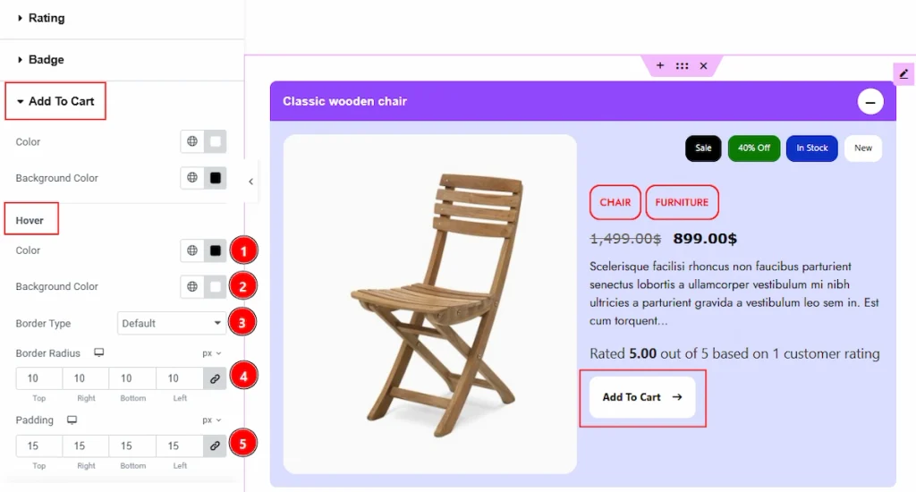
1. Color: You can change the add to cart button text hover color with this option.
2. Background Color: You can change the background hover color with this option.
3. Border Type: You can add and change the border types with this option.
4. Border Radius: You can control the roundness of the border with this option.
5. Padding: You can adjust the inner space of the button in hover state with this option.
All done! You have successfully customized the Product Accordion widget on your website.
Video Assist #
You can also watch the video tutorial to learn more about the Product Accordion Widget. Please visit the demo page for examples.
Thanks for being with us.