



The Product Filters widget from Wow Elements Pro is a powerful tool for adding advanced filtering options to your WooCommerce product listings. It allows customers to filter products based on categories, attributes, prices, ratings, and other available options, making it easier to find the products they need. With flexible filter, layout, and styling controls, you can easily customize the product filters to match your store’s branding and improve the overall shopping experience. In this documentation, we will guide you through how to use and customize the Product Filters widget in Wow Elements Pro.
Enable the Product Filters Widget #
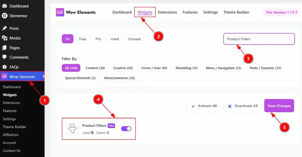
To use the Product Filters by Wow Elements Pro, first, you have to enable the widget.
- Go to WordPress Dashboard → Wow Elements Pro Plugin dashboard.
- Then Click the Widgets Tab.
- Search the Product Filters Widget Name.
- Enable the Product Filters Widget.
- Hit the Save Settings Button.
Inserting the Product Filters widget #
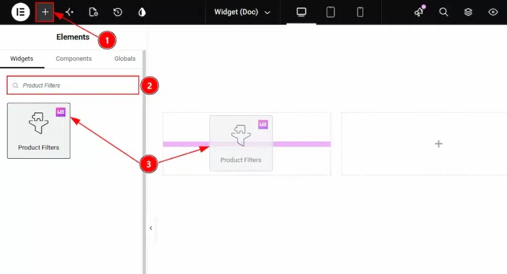
1. Go to the Elementor Editor Page and Hit the “+” icon Button.
2. Search the Product Filters widget.
3. Drag the widget and drop it on the editor page
Note: The Product Filters widget works with Product Grid widget of Wow Elements. Here, we choose the Product Grid widget to show the Product Filters widget features. So, you have to enable the widget and then drag & drop the widget in the same container where you have placed the Product Filters. Let’s see how –
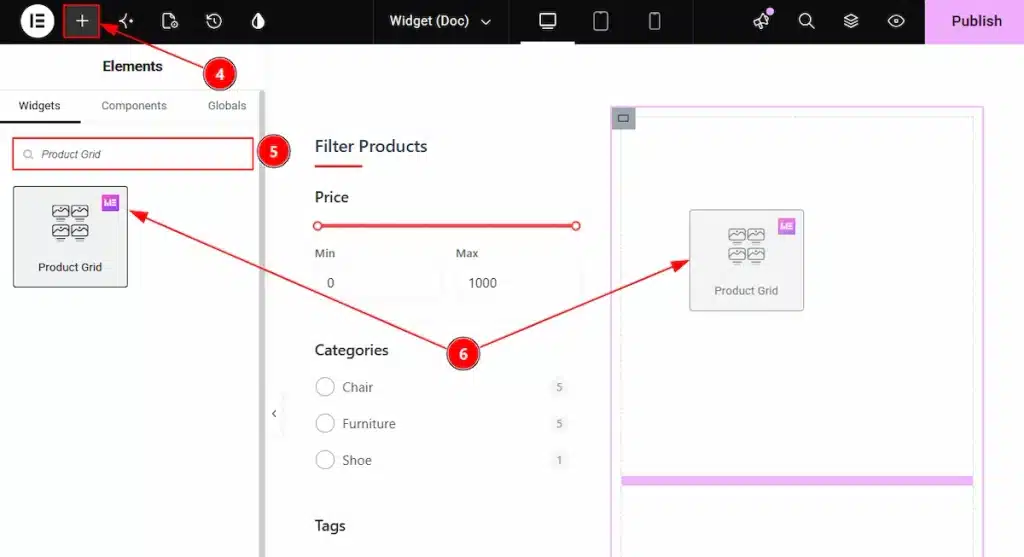
4. Go to the Elementor Editor Page and Hit the “+” icon Button.
5. Search the Product Grid widget.
6. Drag the widget and drop it on the editor page
Content Tab Overview #
Filters Section #
Go to Content → Filters
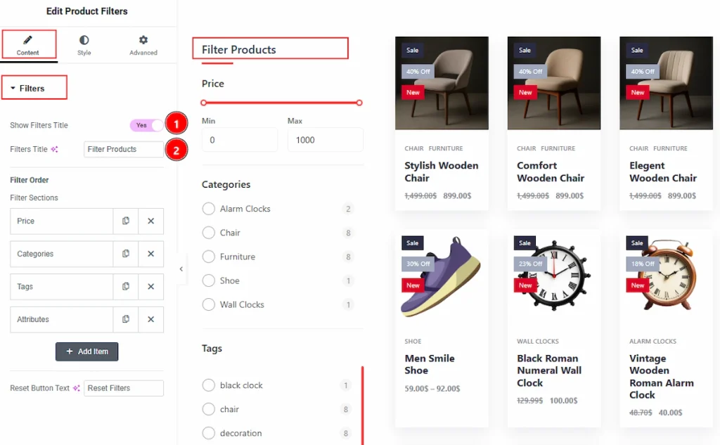
1. Show Filters Title: Enable the switcher to show the Filters title to the audience.
2. Filters Title: You can change the filters title text with this option.
Filter Order Sub Section #
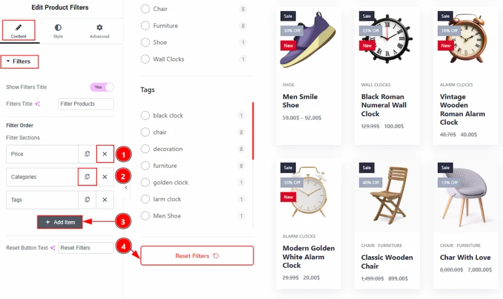
1. Close Item: You can delete the Slider item by clicking the Close icon button.
2. Copy Item: This option lets you copy the same item.
3. Add Item: You can add a new item by clicking the “+”Add Item button.
4. Reset Button Text: You can change the reset button text with this option.
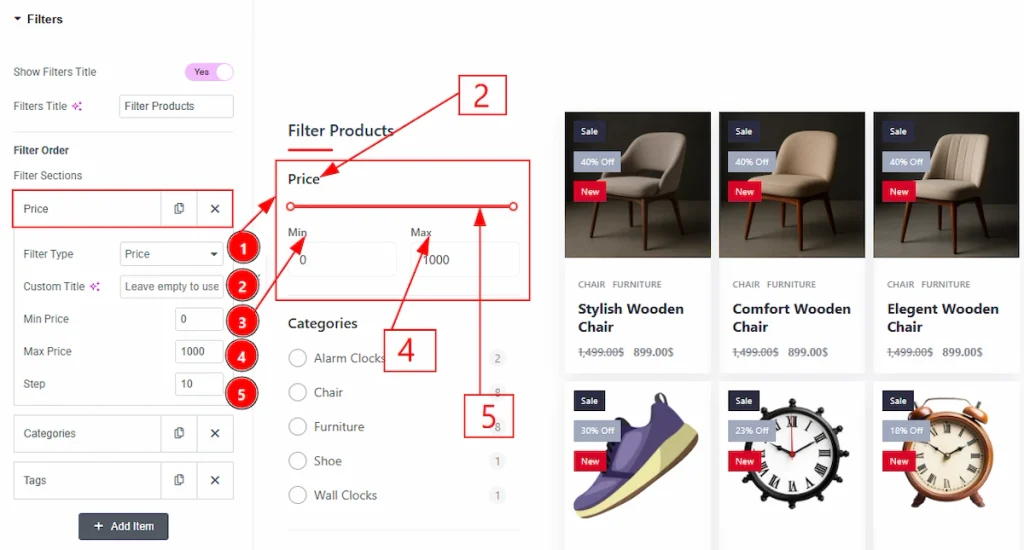
In the Filters order, we have several options. Let’s start with the Price Section –
1. Filter Type: You can change the filter type from here. The types are Price, Categories,Tags & Attributes. Here we selected the type as Price.
2. Custom Title: You can add the title text with this option.
3. Min Price: You can add the minimum price to show products with this option.
4. Max Price: You can add the maximum price to show products with this option.
5. Step: The Step option controls how much the price changes when you move the slider. The number you will set it will move each time as per the maximum price multiplication.
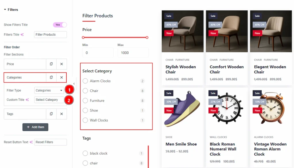
Now let’s proceed to the Category Tab –
1. Filter Type: You can change the filter type from here. Here we selected the type as categories.
2. Custom Title: You can change the field title with this option.
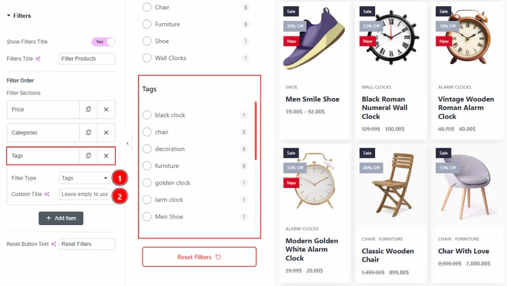
Now, let’s proceed to the Tags Tab –
1. Filter Type: You can change the filter type from here. Here, we selected the type as tags.
2. Custom Title: You can change the filed title with this option.
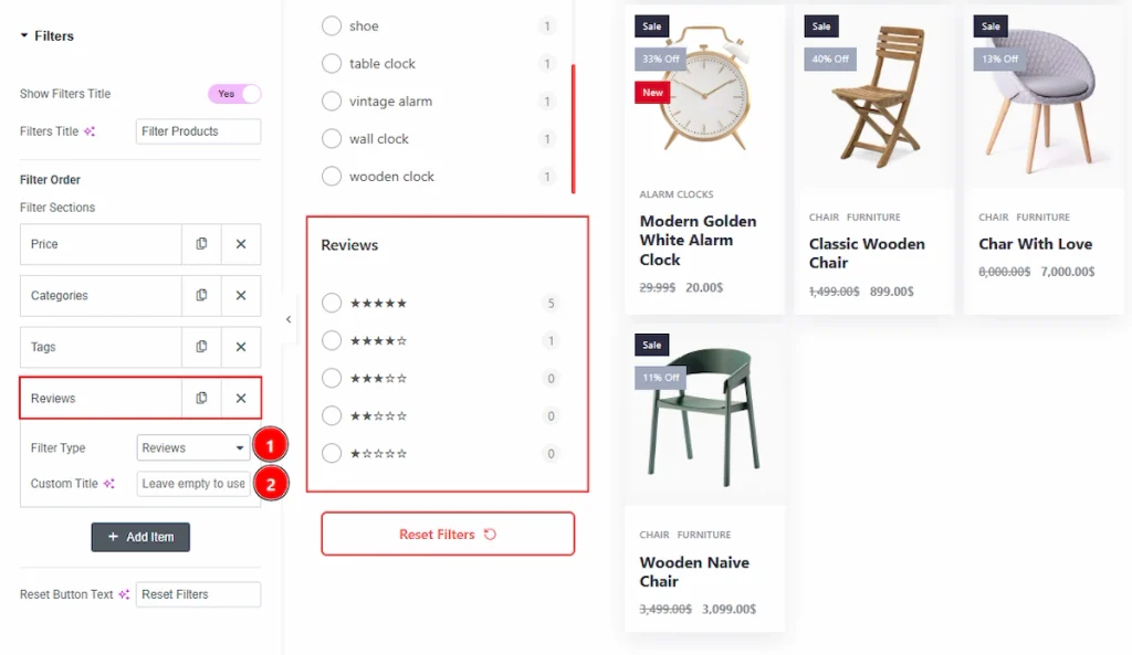
Now, let’s proceed to the Reviews Tab –
1. Filter Type: You can change the filter type from here. Here, we selected the type as reviews.
2. Custom Title: You can make changes to the title field with this option.
Work with The Style Tab #
Filter: Header Title Section #
Go to Style → Filter : Header Title
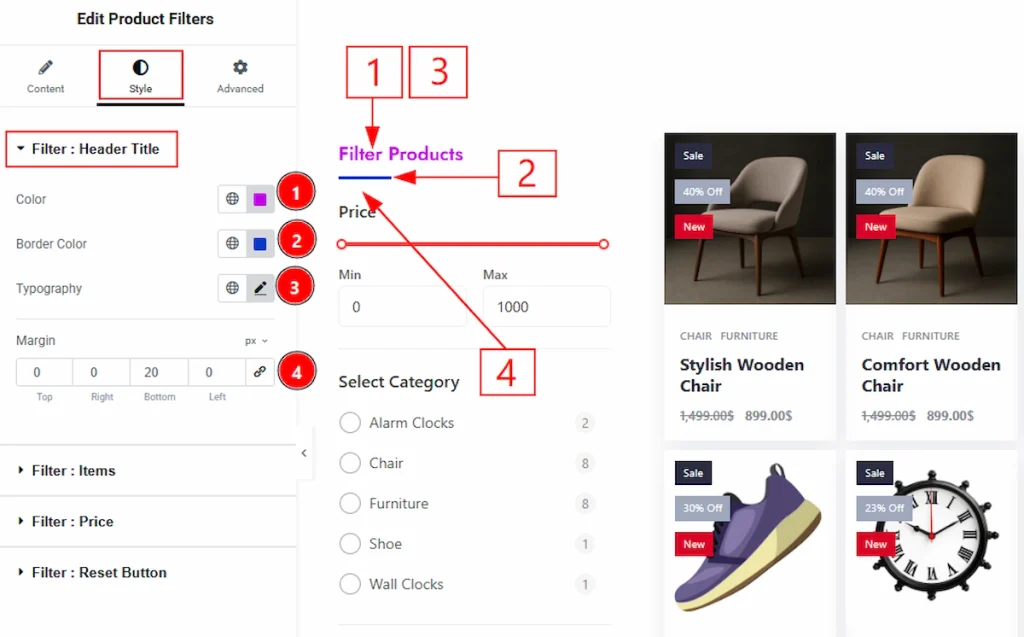
1. Color: You can make changes to the header title text color with this option.
2. Border Color: You can make changes to the border color with this option.
3. Typography: Change the font family, size, weight, transform, style, decoration, line height, letter spacing, and word spacing from here.
4. Margin: This option allows you to adjust the space & gaps between the elements.
Filter: Items Section #
Go to Style → Filter : Items
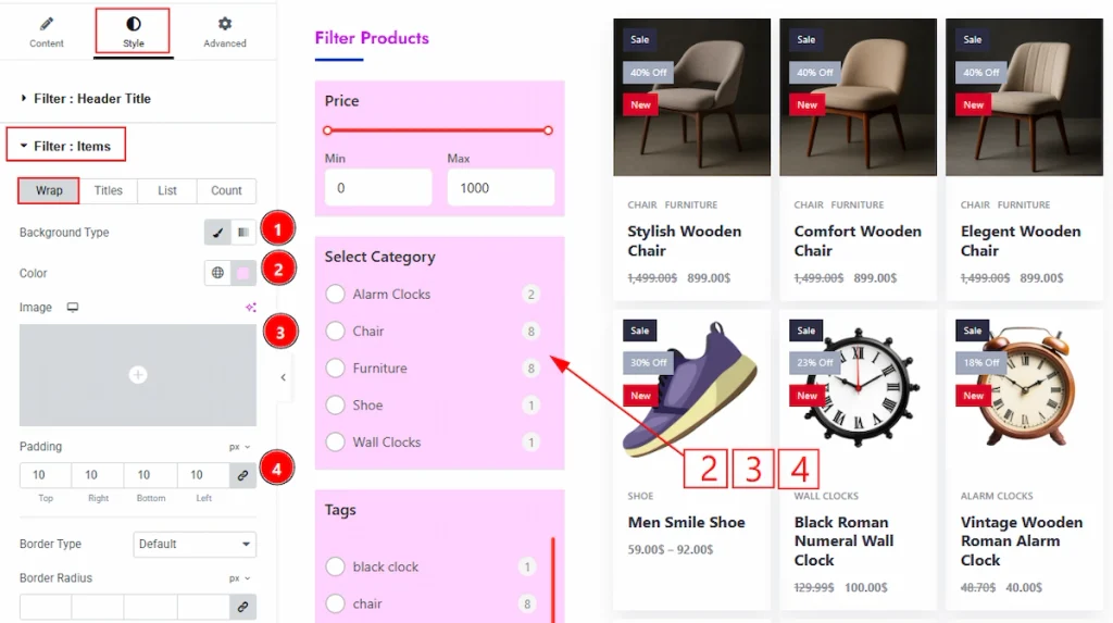
In this section, we have four more tabs. These are Wrap, Titles, List & Count. Let’s start describing those one by one.
1. Background Type: You can change the background type to be classic or gradient with this option. Here, we have selected the background type as Classic.
2. Color: You can make changes to the background color with this option.
3. Image: You can make changes to the background image with this option.
4. Padding: You can adjust the inner space with this option.
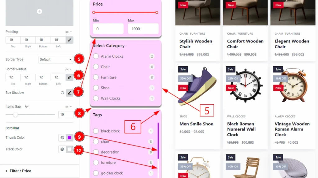
5. Border Type: You can add and change the border types with this option.
6. Border Width: You can set the thickness of the border with this option.
7. Border Color: You can make changes to the border color with this option.
8. Border Radius: You can control the roundness of the border with this option.
9. Box Shadow: You can add a shadow effect to the item field with this option.
10. Items Gap: You can adjust the space between the items with this option.
11. Thumb Color: You can make changes to the thumb color with this option.
12. Track Color: You can make changes to the track color with this option.
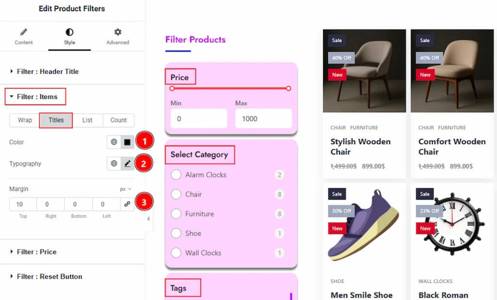
Now, let’s proceed to the Titles tab –
1. Color: You can change the title color with this option.
2. Typography: Change the font family, size, weight, transform, style, decoration, line height, letter spacing, and word spacing from here.
3.Margin: This option allows you to adjust the space & create gaps between elements.
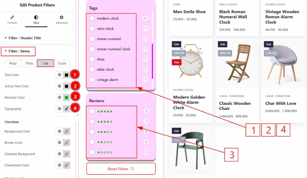
Now, let’s proceed to the List Tab –
1. Text Color: You can change the list text color with this option.
2. Active Text Color: You can change the active text color with this option.
3. Review Color: You can make changes to the review start color with this option.
4. Typography: Change the font family, size, weight, transform, style, decoration, line height, letter spacing, and word spacing from here.
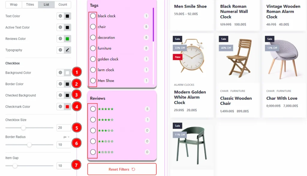
1. Background Color: You can change the checkbox background color with this option.
2. Border Color: You can change the checkbox border color with this option.
3. Checked Background: You can change the checked background color with this option.
4. Checkmark color: You can check the checkmark color with this option.
5. Checkbox Size: This option allows you to make changes to the checkbox size.
6. Border Radius: You can control the checkbox border roundness with this option.
7. Item Gap: You can adjust the space between the checkbox with this option.
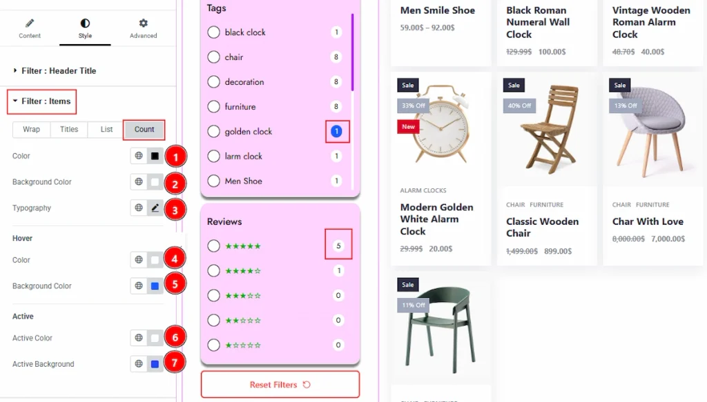
Now, let’s proceed to the Count Tab –
1. Color: You can change the count text color with this option.
2. Background Color: You can change the count background color with this option.
3. Typography: You can change the font family, size, weight, transform, style, decoration, line height, letter spacing, and word spacing from here.
4. Color: You can change the count text’s hover color with this option.
5. Background Color: You can change the count’s background hover color with this option.
6. Active Color: You can change the count text’s active color with this option.
7. Active Background: You can change the count’s active background color with this option.
Filter : Price Section #
Go to Style → Filter : Price
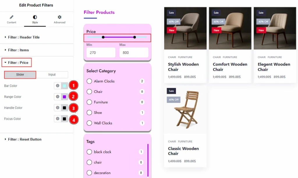
In this section, we have two tabs. These are Slider & Input. Let’s start describe the Slider Tab first –
1. Bar Color: You can change the bar color with this option.
2. Range Color: You can change the range color with this option.
3. Handle Color: You can change the handle color with this option.
4. Focus Color: You can change the focus color with this option.
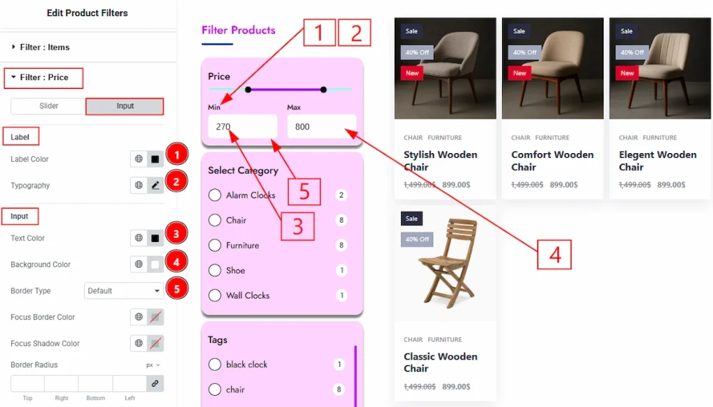
Now, let’s proceed to the Input Tab –
1. Label Color: You can change the label color with this option.
2. Typography: Change the font family, size, weight, transform, style, decoration, line height, letter spacing, and word spacing from here.
3. Text Color: You can change the text color with this option.
4. Background Color: You can change the background color with this option.
5. Border Type: You can add and change the border types with this option.
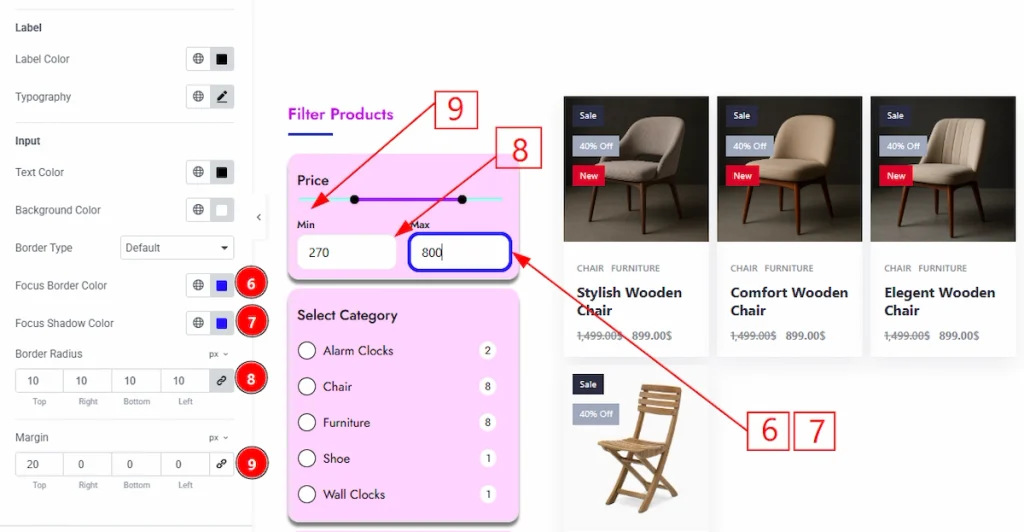
6. Focus Border Color: You can change the focus border color with this option.
7. Focus Shadow Color: You can change the focus shadow color with this option.
8. Border Radius: This option controls the roundness of the border with this option.
9. Margin: This option allows you to adjust the space & create gaps between elements.
Filter : Reset Button Section #
Go to Style → Filter : Reset Button
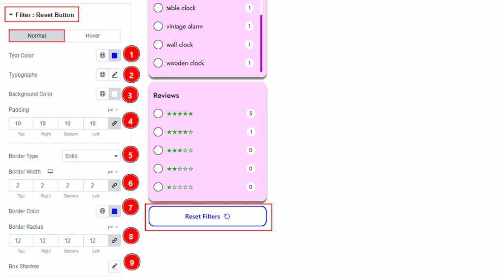
In this tab, we have two more tabs. One is Normal and the other is Hover. Let’s start with the Normal tab –
1. Text Color: You can change the button text color with this option.
2. Typography: Change the font family, size, weight, transform, style, decoration, line height, letter spacing, and word spacing from here.
3. Background Color: You can change the background type with this option.
4. Padding: You can adjust the inner space and gaps of the reset button with this option.
5. Border Type: You can add and change the border types with this option.
6. Border Width: You can set the thickness of the border with this option.
7. Border Color: You can make changes to the border color with this option.
8. Border Radius: You can control the roundness of the border with this option.
9. Box Shadow: You can add a shadow effect to the reset filter button with this option.
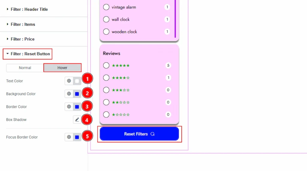
Now, Let’s Proceed to the Hover Tab –
1. Text Color: You can change the button text hover color with this option.
2. Background Color: You can change the background hover color with this option.
3. Border Color: You can change the border color with this option.
4. Box Shadow: You can add a hover shadow effect with this option.
5. Focus Border Color: You can change the focus border hover color with this option.
All done! You have successfully customized the Product Filters widget on your website.
Video Assist #
You can also watch the video tutorial to learn more about the Product Filters Widget. Please visit the demo page for examples.
Thanks for being with us.