



The Logo Carousel widget from Wow Elements helps you present brand or client logos in an interactive sliding format, making your website feel more dynamic and professional. It’s a great way to highlight collaborations while saving space and keeping the layout clean. With customizable speed, navigation, and styling controls, you can easily create a seamless scrolling experience. This documentation will guide you on how to set up and personalize the Logo Carousel widget in Wow Elements.
Enable The Logo Carousel Widget #

To use the Logo Carousel widget from Wow Elements, first, you have to enable the widget.
- Go to WordPress dashboard → Wow Elements Plugin dashboard.
- Then, Click the Core Widgets Tab.
- Search the Logo Carousel Widget Name.
- Enable the Logo Carousel Widget.
- Hit the Save Settings Button.
Inserting The Logo Carousel Widget #
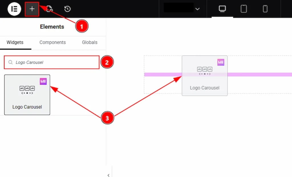
1. Go to the Elementor Editor Page and hit the “+” icon Button.
2. Search the Logo Carousel name.
3. Drag the widget and drop it on the editor page.
Work With The Content Tab #
Layout Section #
Go to Content → Layout
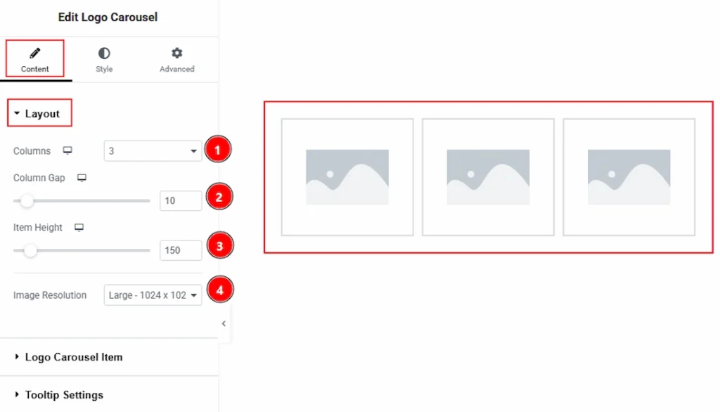
1. Columns: You can select the column number that you want to show to your audience with this option.
2. Column Gap: You can adjust the space between the Carousel with this option.
3. Item Height: You can adjust the height of the items with this option.
4. Image Resolution: You can make changes to the image resolution with this option.
Logo Carousel Items Section #
Go to Content → Logo Carousel Items
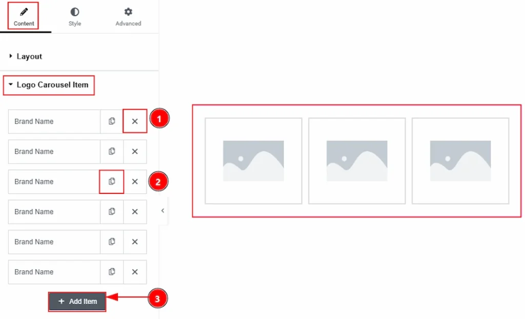
1. Close Button: You can click on the close icon to remove the logo Carousel items with this option.
2. Copy Button: You can click on the copy button to duplicate the logo Carousel item with this option.
3. Add Item: You can click on this button to add more logo Carousel items.
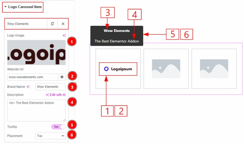
In each item of the logo Carousel, you will get more options where you can add information to show to your audience. Let’s explore those now –
1. Logo Image: You can add the logo image in this field.
2. Website URL: You can add a link to the logo image with this option.
3. Brand Name: You can add and make changes to the brand name with this option.
4. Description: You can add and make changes to the description with this option.
5. Tooltip: Enable the switcher to show the brand name & description as a tooltip with this option.
6. Placement: You can set the tooltip position to top, top left, top right, bottom, bottom left, bottom right, left, or right with this option.
Tooltip Settings Section #
Go to Content → Tooltip Settings

1. Animation: You can add an animation to the tooltip appearance with this option.
2. X Offset: You can move the tooltip position horizontally with this option.
3. Distance: You can move the tooltip position vertically with this option.
4. Arrow: Enable the switcher to add an arrow to the tooltip.
5. Trigger On Click: You can enable the switcher to make the tooltip visible when clicked on the image. Don’t set yes when you set a lightbox image with a marker.
Carousel Settings Section #
Go to Content → Carousel Settings
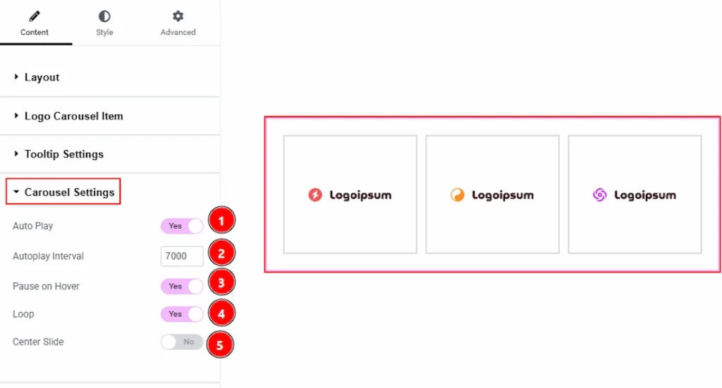
1. Auto Play: Enable the switcher to automatically run the carousel one by one with this option.
2. Autoplay Interval: You can adjust the delay time to move the items one by one with this option.
3. Pause on Hover: Enable the switcher to pause the autoplay when you hover over the logo items with this option.
4. Loop: Enable the switcher to start the autoplay again when it reaches the last logo item.
5. Center Slide: Enable the switcher to slide the carousel to the center with this option.
Navigation Section #
Go to Content → Navigation
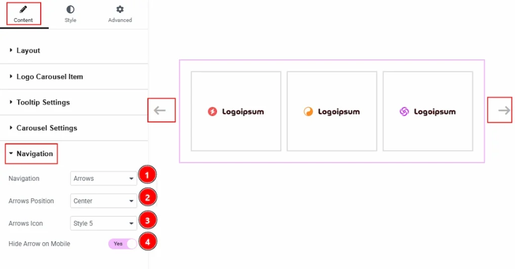
1. Navigation: You can select the navigation type with this option.
2. Arrows Position: You can make changes to the arrows position with this option.
3. Arrows Icon: You can choose the arrow icon style with this option.
4. Hide Arrows on Mobile: Enable the switcher to hide the arrows on mobile device with this option.
Work with The Style Tab #
Logo Carousel Section #
Go to Style → Logo Carousel
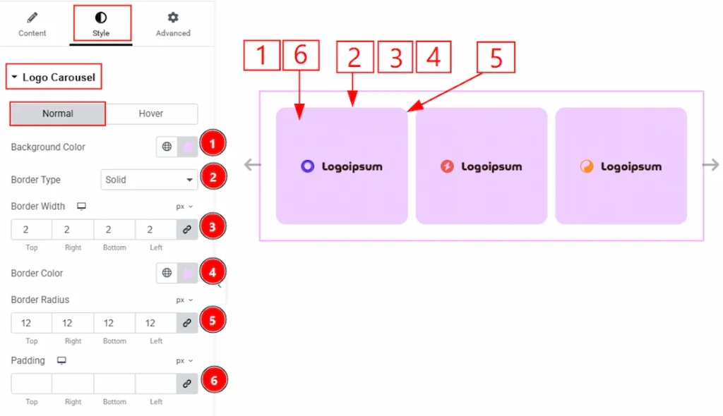
In this section, we have two more tabs. These are Normal & Hover. Let’s start describing the Normal Tab first –
1. Background Color: You can make changes to the logo Carousel items’ background color with this option.
2. Border Type: You can add and change the type of borders with this option.
3. Border Width: You can set the thickness of the border with this option.
4. Border Color: You can change the border color with this option.
5. Border Radius: You can control the roundness of the border with this option.
6. Padding: You can adjust the inner space of the items with this option.
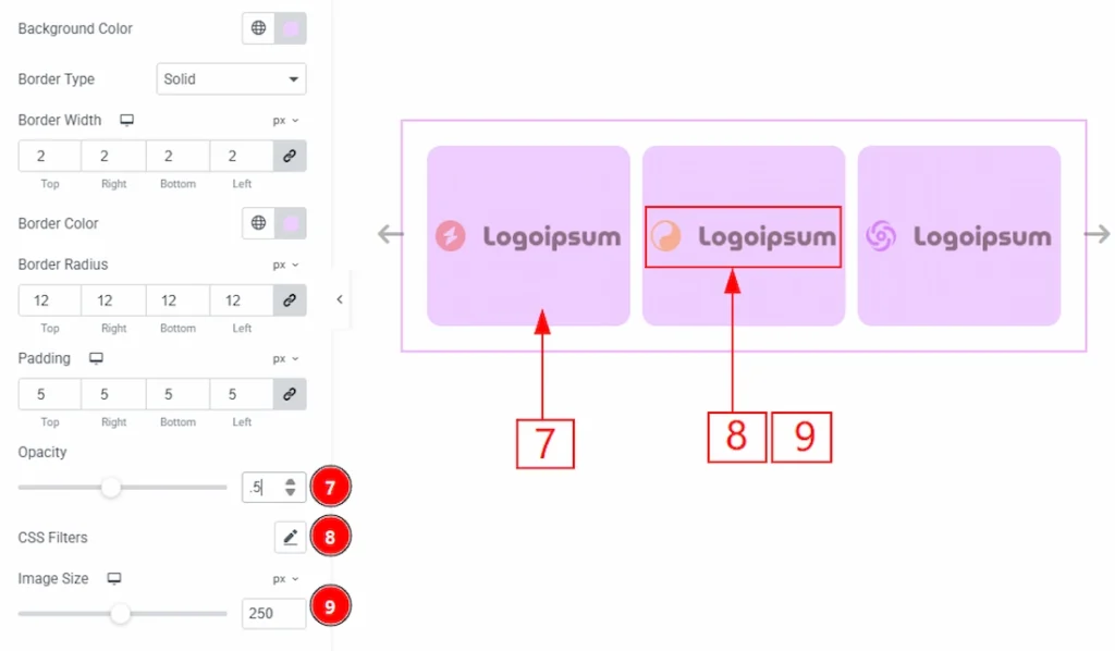
7. Opacity: You can adjust the transparency of the items with this option.
8. CSS Filter: You can customize the image by making changes to blur, brightness, contrast, saturation & hue with this option.
9. Image Size: You can make changes to the image size with this option.
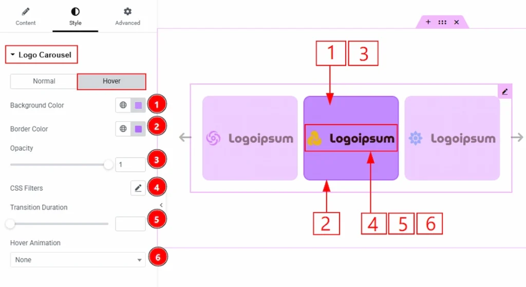
Now, let’s proceed to the Hover Tab –
1. Background Color: You can make changes to the background hover color with this option.
2. Border Color: You can change the hover border color with this option.
3. Opacity: You can adjust the item hover transparency with this option.
4. CSS Filters: You can customize the image with this option.
5. Transition Duration: You can adjust the transition duration with this option.
6. Hover Animation: You can set the hover animation type for the items with this option.
Tooltip Section #
Go to Style → Tooltip
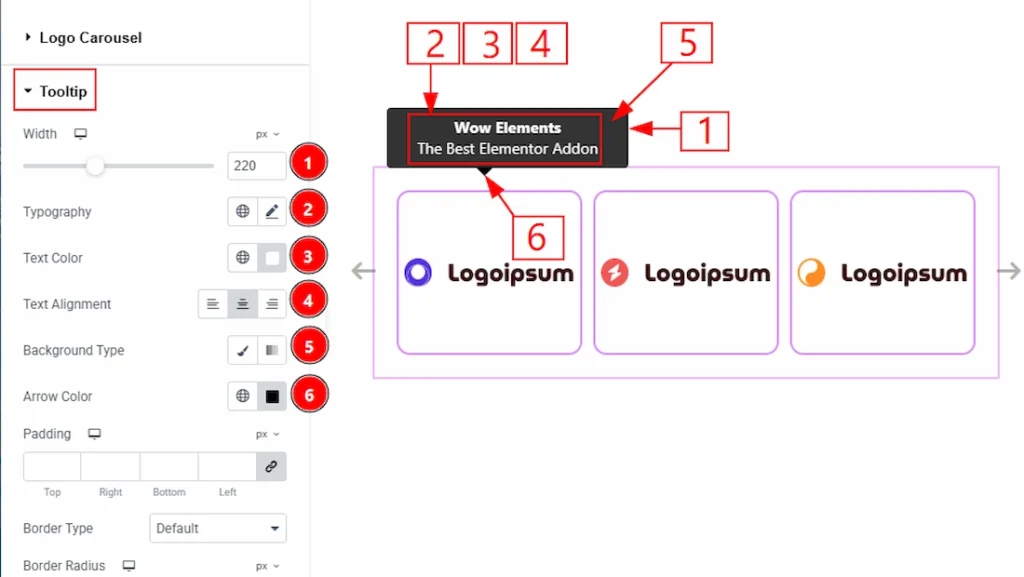
1. Width: You can adjust the height of the tooltip layout with this option.
2. Typography: Change the font family, size, weight, transform, style, decoration, line height, letter spacing, and word spacing from here.
3. Text Color: You can make changes to the description text color with this option.
4. Text Alignment: You can adjust the tooltip content position to left, center or right with this option.
5. Background Type: You can choose the background type to be classic or gradient with this option. Here, we have chosen the background type as classic.
6. Arrow Color: You can change the arrow color with this option.
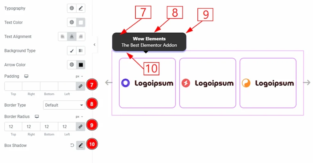
7. Padding: You can adjust the inner space of the tooltip field with this option.
8. Border Type: You can add and change the border types with this option.
9. Border Radius: You can control the roundness of the border with this option.
10. Box Shadow: You can add a shadow effect to the tooltip layout with this option.
Navigation Section #
Go to Style → Navigation
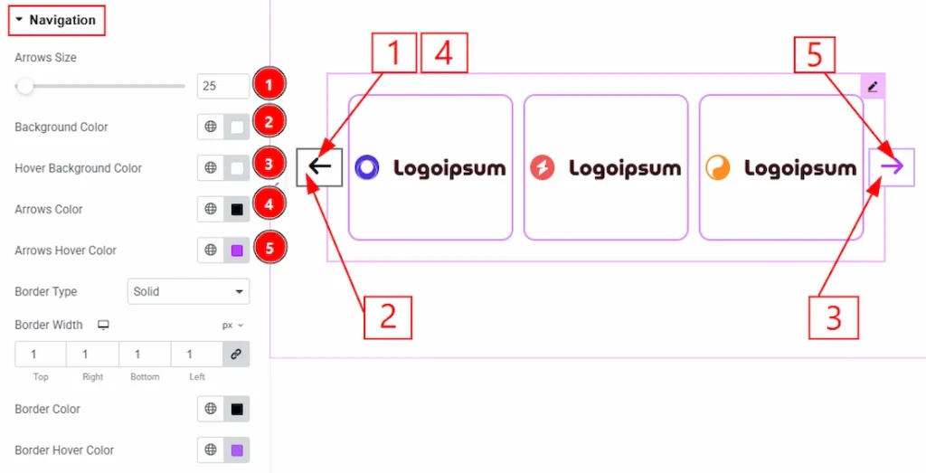
1. Arrows Size: You can make changes to the navigation arrows size with this option.
2. Background Color: You can make changes to the arrows background color with this option.
3. Hover Background Color: You can make changes to the arrows background hover color with this option.
4. Arrows Color: You can make changes to the navigation arrows color with this option.
5. Arrows Hover Color: You can change the arrows icon hover color with this option.
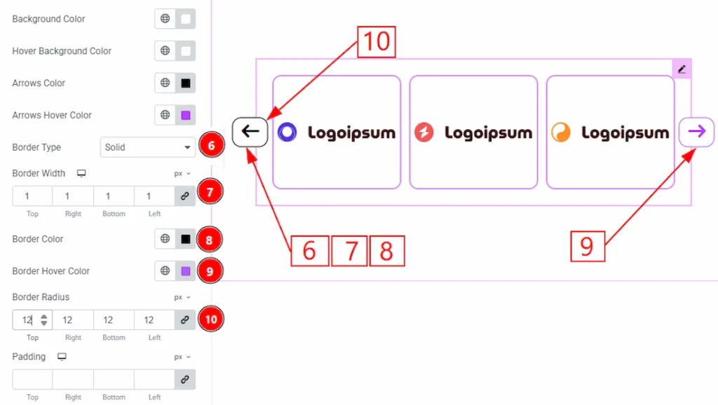
6. Border Type: You can add and change the border types with this option.
7. Border Width: You can set the thickness of the border with this option.
8. Border Color: You can make changes to the border color with this option.
9. Border Hover Color: You can make changes to the border hover color with this option.
10. Border Radius: You can control the roundness of the border with this option.
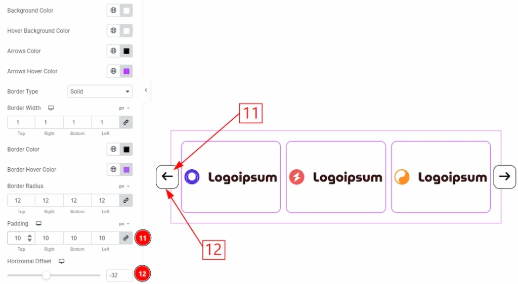
11. Padding: You can adjust the inner space of the navigation field with this option.
12. Horizontal Offset: You can move the arrows horizontally with this option.
Video Assist #
You can also watch the video tutorial to learn more about the Logo Carousel. Please visit the demo page for examples.
Thanks for being with us.